
Creating/ Editing a Hosted Resource
First things first, you need to create a new branch for your new resource. You can do this by first making sure you are on the ‘Main’ Branch, and then clicking the ‘Create New Branch’ button. You will be presented with a pop-up window where you can add your branch name, remembering to replace spaces with hyphens.
Adding the Hosted Resource Metadata
The metadata requirements for a hosted resource are less than for an external resource, but there are still some items to pay attention to.
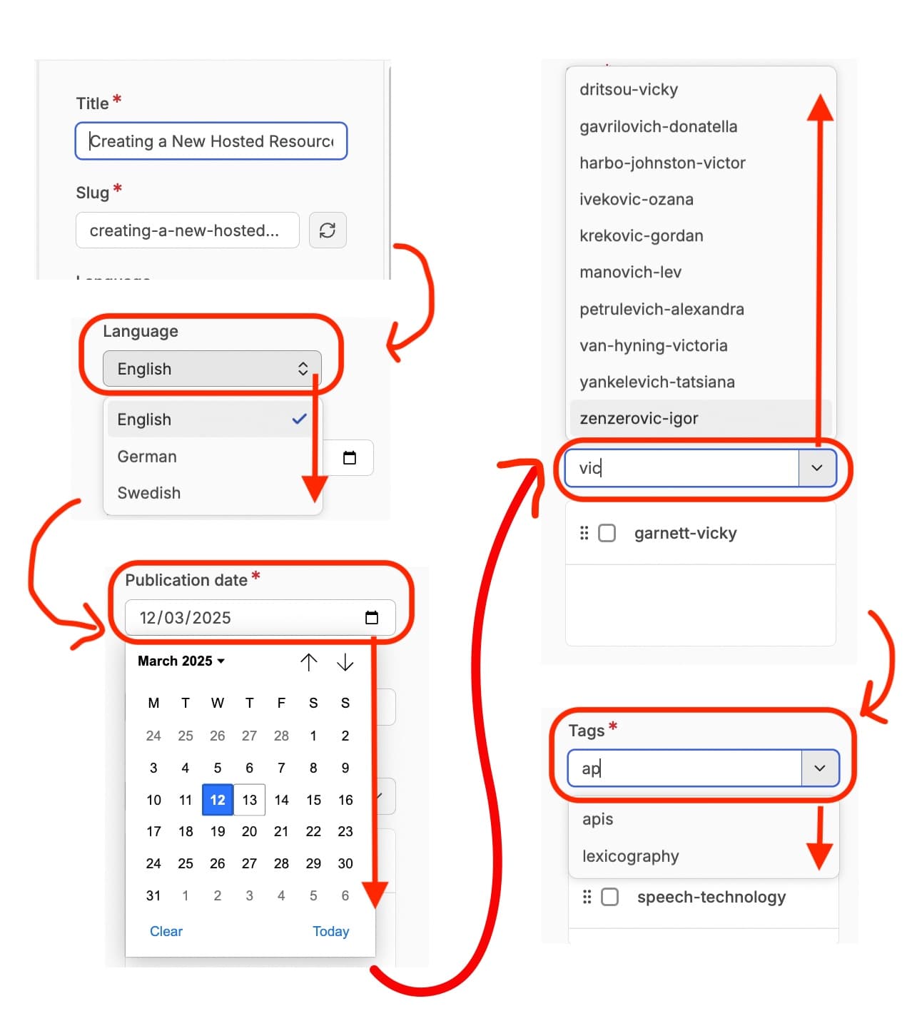
The first field is the title of the resource. This in turn generates the ‘slug’ for the url of the resource, based on the title.
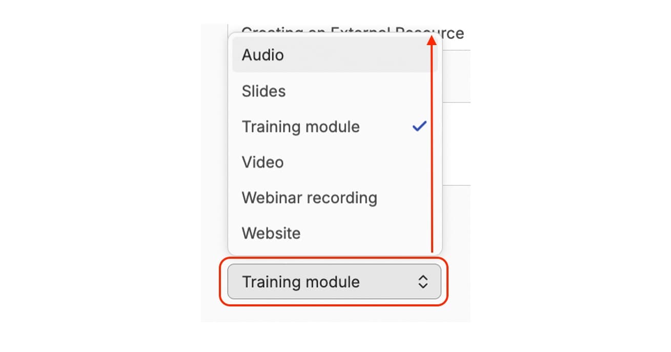
You can then select the language of the resource. This is through a dropdown menu. At the time of writing this documentation (May 2025) we only support two languages, but we hope this will change to allow you to add resources in other languages.
You are then asked to give the Publication Date. This publication date refers to the date that this resource is published to DARIAH-Campus. For that reason it defaults to whatever today’s date is. You should leave it at this, but you might be asked to update this when the resource is ready to be published following review from the Editorial Team.
Below this is the ‘Version’ number. By default this is set to 1.0.0. However, if you are making substantial changes to a resource (e.g. major content updates, not just typos), this will need to be changed to indicate that this is a new version. For now, though, as you are creating a new resource, you can leave this at the default setting.
Next you will need to add the Authors of your resource. This is done using the people already published on the system. This field is both a search box and a drop down menu, but the quickest way to find someone is to start typing one or two letters of their name into the search field, and the drop down menu will filter down to only the named people with those letters in that order in their name. From there you can select which person you want to include. For resources with multiple authors you can repeat this step.
Once you have selected an author or authors, it will appear in a box below the drop down menu. For each person there is the option to change the order of authors listing, indicated by an icon featuring six dots, or the option to select that author, indicated by a checkbox, so that you can remove them from the list if required.
Tags are selected in the same way as authors. You can use the search field next to the drop down button to start typing a topic, and select an appropriate tag from or tags from there. You can also re-order these by clicking on the 6 dots and dragging the tag up or down the list.
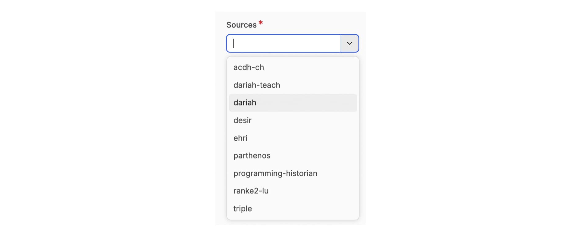
Sources are also selected in the same way. The ‘Source’ is used to assign a ‘channel’. In most cases, the source is ‘DARIAH’, unless you already have a dedicated ‘channel’ in place as agreed with the DARIAH-Campus Editorial Board.
You can also choose to add a ‘Featured Image’. Click on the ‘Choose File’ button. This will open the appropriate file management window for your operating system (e.g. Finder for Mac, File Explorer for Windows) to allow you to select an image from your own computer. One selected and confirmed, the featured image will be displayed as a thumbnail in this metadata field. You will also now have the option to remove this file if you choose.
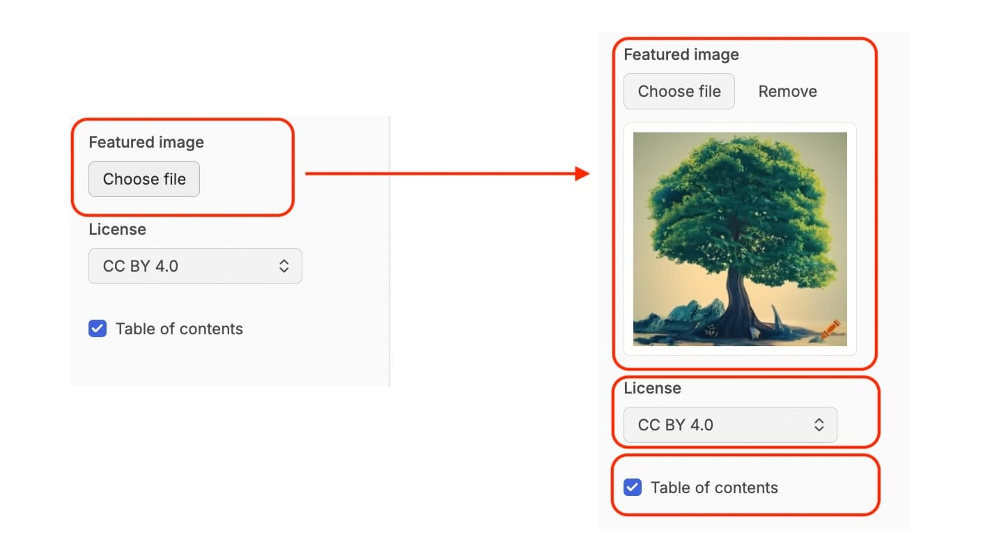
Underneath this featured image field is the ‘Licence’ field which describes the licence for the whole resource. This is offered as a dropdown menu, but we only offer ‘CC-BY 4.0’ as an option, so you can leave this unchanged.
There is also a checkbox for whether or not to show a Table of Contents. The Table of Contents is generated using the headings you have in your resource. This is useful for learners to navigate through your resource, especially if it is a particularly long resource. You will also have noticed that we have a table of contents for this documentation. The Table of Contents checkbox is ticked by default, and we recommend that you make sure this is the case for your resource as well.
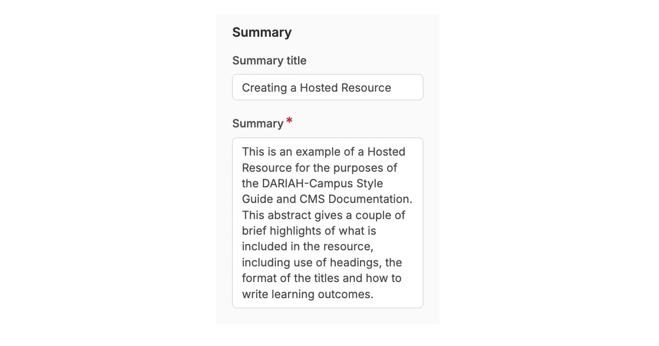
The Summary (formerly known as the ‘Abstract’) is the information that is displayed on the main ‘Resources’ page of DARIAH-Campus and offers a short preview into what the resource is about to entice the learner. The summary should be no longer than 80 words, and should describe what is covered in the resource.
If the title of your resource is very long, you can also use the ‘Summary Title’ field to write a shorter, but still meaningful, title, and this will display on the Resources page.
Finally, Sources are selected in the same way as for Authors and Tags. The ‘Source’ is used to assign a ‘channel’. In most cases, the source is ‘DARIAH’, unless you already have a dedicated ‘channel’ in place as agreed with the DARIAH-Campus Editorial Board.
This completes all the metadata fields for a hosted resource, and at this point you can now ‘Create’ your initial draft by clicking on the blue button in the top right-hand corner of the screen. This will save all the metadata. Once you have created the draft, the blue button will change to say ‘Save’. We recommend that you save your work frequently to avoid any loss of content.
Writing the Content of Your Hosted Resource
The large middle field in the CMS is your main content creation area. This is where you will write your hosted resource. There are a few things to keep in mind in relation to the house style, specifically around the types of headings used, and the order in which they appear. For that reason, as part of this step by step guide, an ‘Example Hosted Resource’ has been created for you to refer to when drafting up content. You can find the latest preview of the ‘Example Hosted Resource’ by clicking on the most recent ‘View Deployment’ on this Pull Request. You can view the House Style here.
First things first, get to know the different functions along the top formatting bar.
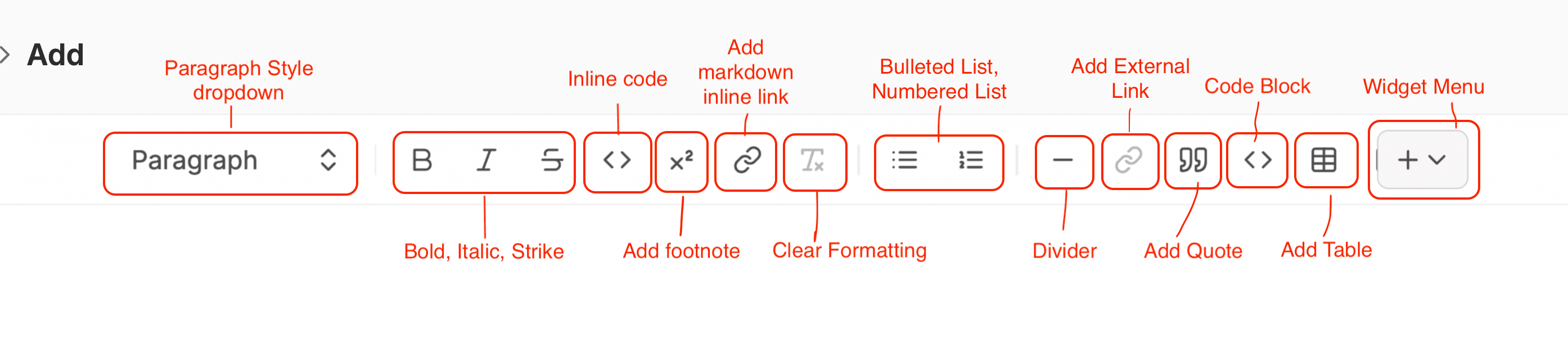
From left to right:
Paragraph style - this drop down menu allows you to determine whether something is normal paragraph text, or a specific heading type.
Bold, Italic, Strikethrough - these function the same as in other text editing software.
Inline Code - There are two ‘code’ icons on this formatting bar. This one on the left, the ’<>’ icon, allows you to format one or more words in your paragraph as code. Use it for short snippets of code, variable names, file paths, or short instructions.

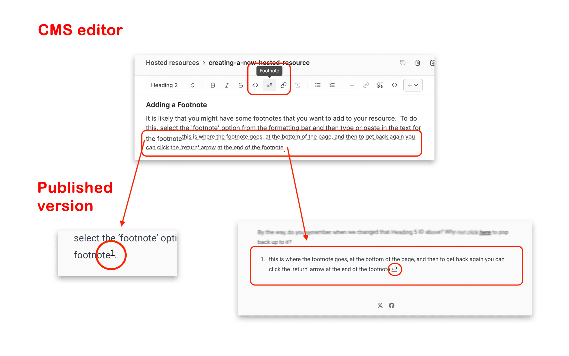
Footnote - this icon allows you to create a footnote. Click on the icon and type in or paste in your footnote. This will appear as superscript, but in the published version that text will appear at the very end of the resource as a footnote, and a reference number will appear where you typed this text.
Campus Link - there are two ‘link’ icons. This first one to the left allows you to link to another resource or download within DARIAH-Campus. This is useful if you have related learning resources and want to guide users to them.
Clear Formatting - as in most document formatting, this allows you to clear all the formatting in selected text.
Bulleted List, Numbered List - allows you to add either a bulleted list or a numbered list to your text.
Divider - draws a solid straight horizontal line. This is useful if you want to separate sections even more clearly. You might place this underneath the ‘Learning Outcomes’ for example, to separate this from the rest of the actual resource.
External Link - This is the second of the two ‘link’ icons. For this link option it allows you to add any URL you want.
Quote Block- If you want to pull out some text to make it more memorable, or if you want to add a quote, this icon allows you to do this.
Code Block - This is the second of the two ‘Code’ icons. Use it for longer code examples or instructions that stand on their own like a paragraph. You can set the programming language in the pop-out window that appears in order to enable syntax highlighting. In the example below we set the programming language to ‘C’. You then type the code you want to include directly into the ‘Code Block’ box.
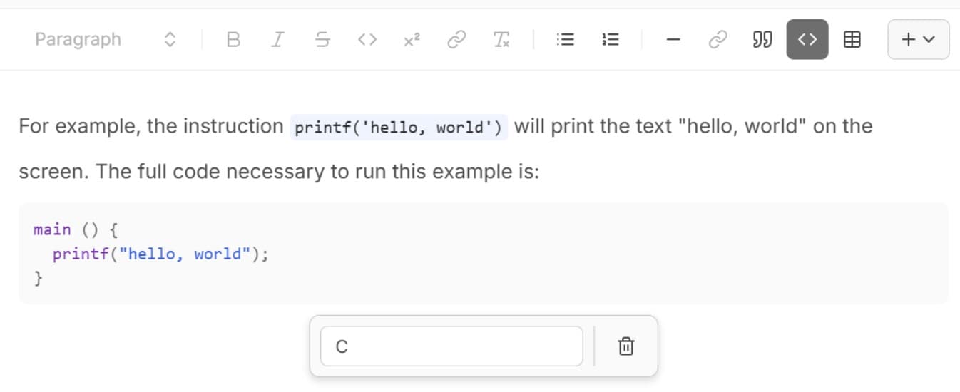
You can find the supported programming languages here. Use the value from the ID column in the pop-out window.
Highlighting lines or words in code blocks is supported via special comment syntax.
To highlight a line, place a comment at the end of the line:
console.log('Not highlighted')
console.log('Highlighted') // [!code highlight]
console.log('Not highlighted')
This will render:
console.log('Not highlighted')
console.log('Highlighted')
console.log('Not highlighted')
Table - Use this icon to add a table. It will show a 3 x 3 table by default, but you can edit this. Do note, though, that larger tables don’t work as well on mobile devices.
You can use all these options to draft up your content and make things a little more interesting for your learners. It also helps you to comply with the house style, including adding the correct heading types, and formatting for required elements such as the Introduction, Learning Outcomes, and Conclusion.
You can make things even more interesting for your learners by making use of Widgets, which are detailed below.
Making use of the Widgets
You will have noticed that the final button on the formatting bar was not mentioned above. This is the ‘Widgets’ drop down menu, and this contains other options you might want to include in your hosted resource. These are all explained below, in the order they appear on the drop down menu.
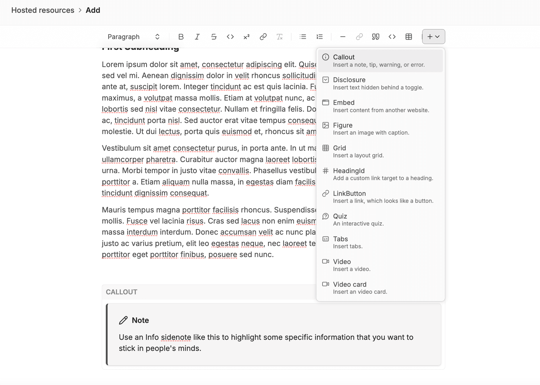
Call out / Sidenote
If you want to highlight some information, or give a warning or a tip within your learning resource, a ‘Callout’ (otherwise called a ‘Sidenote’) can do this for you.
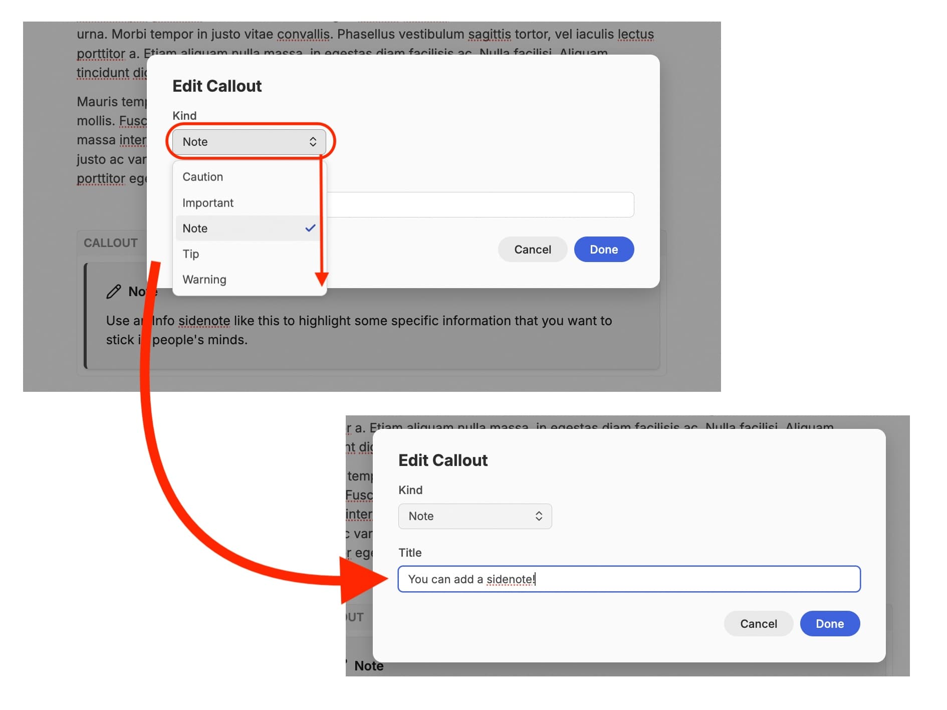
When you first click on this option, a blank ‘Note’ box will appear where you had your cursor. At the same time, a ‘pop-up’ will appear allowing you to edit this. You can choose from different types of call out, and this will determine the colour of the box when it appears in the resource. You can also edit the title of the note, leaving it as its default, or changing it to something more specific to your content.
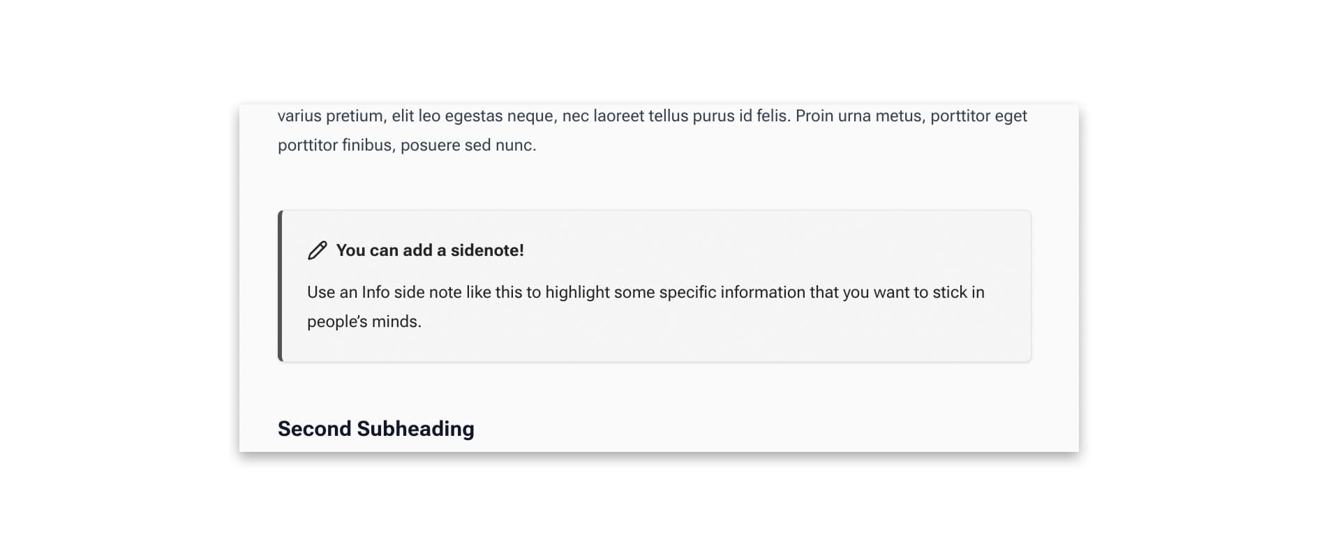
Once your resource is published, your callout (sidenote) will look something like this:
Diagram
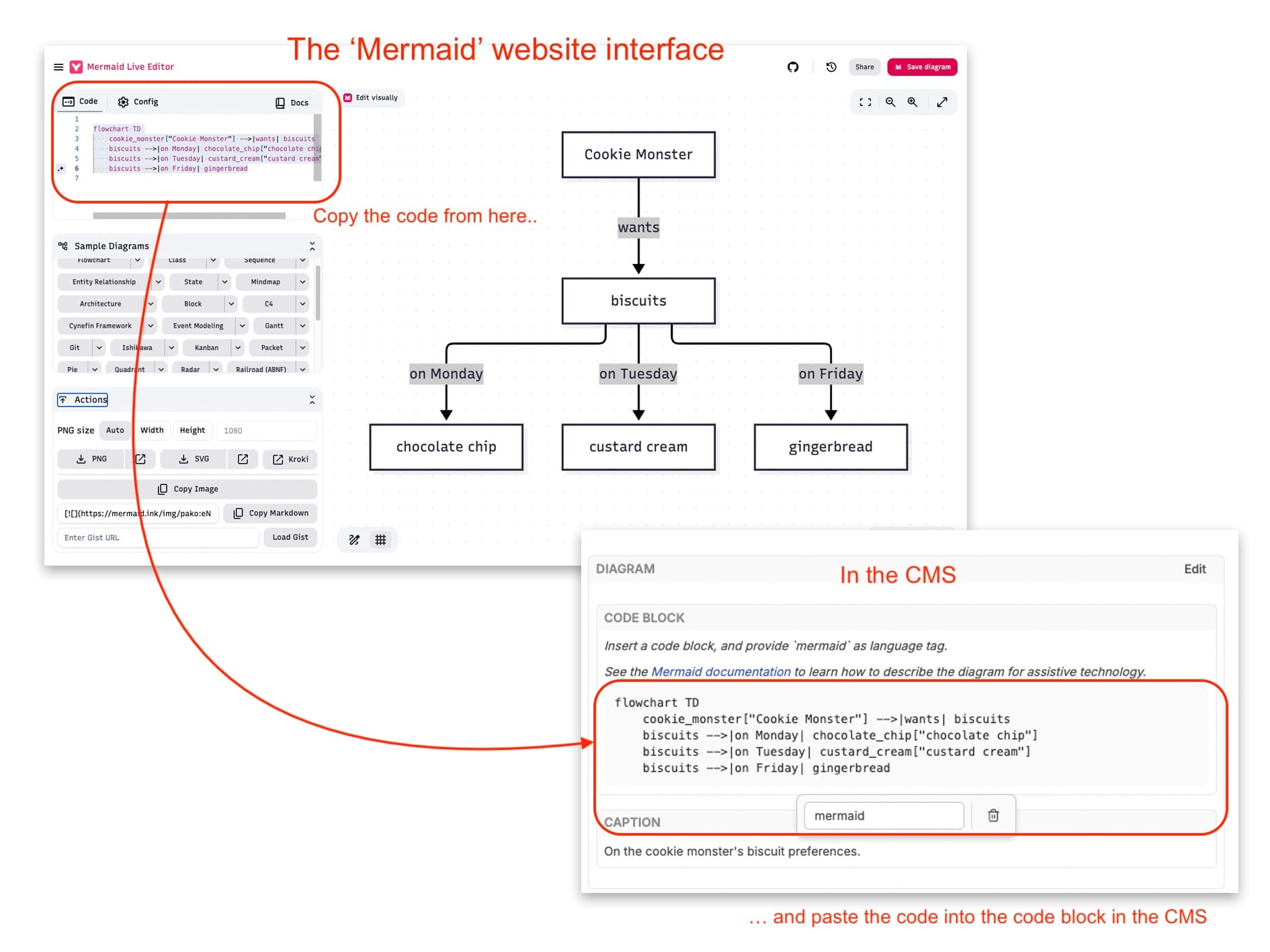
If you are familiar with the ‘Mermaid’ interface, and how it can create appealing visualisations, you might want to make use of the ‘Diagram’ widget to bring your ‘mermaid’ diagrams into your learning resource.
To do this, select ‘Diagram’ from the widget dropdown menu.
An editable box will appear with a ‘code block; box inside it. This box tells you to add a ‘code block’ in order to add the markdown from the Mermaid website.
Click into the code block box, and then from the formatting bar, select the right-hand ‘code’ option. A greyed out block will appear in the ‘code block’ box. It is this greyed box where you will add the markdown.
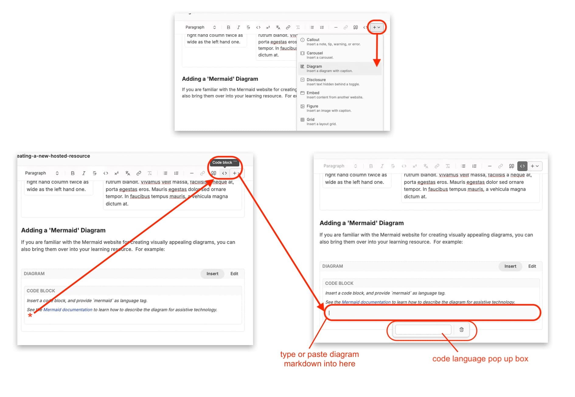
From the Mermaid interface, you can copy the markdown code for your diagram directly, and then paste this into the grey code block back over in the Campus CMS. A pop up box will also require you to define the ‘language’ of the code, and here you can write in ‘mermaid’.
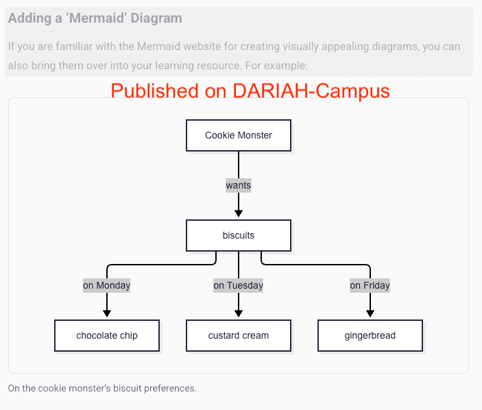
When published, you will see your diagram in its illustrative form.
Disclosure
A Disclosure allows you to insert text that is hidden behind an interactive ‘toggle’, allowing the learner to reveal further information or content. You could use this for self-assessment, posing a question and then revealing the answer on a click. Or you could use it for more in-depth content such as case studies, or a further reading list.
Best practice for accessibility recommends putting items like disclosures, quotes or tabs into a call out box (see above), as this identifies the item as an ‘asset’ for screenreaders. You should add a ‘plain’ callout and then you can add the ‘disclosure’ widget inside the callout box by clicking to bring the cursor into the box in the same way you would start typing, and then selecting ‘disclosure’ (or indeed ‘tab’) from the widget menu.
When you click on the ‘Disclosure’ widget option, an editable version will appear. Click on the ‘edit’ button to open a pop-up window that asks you to give it a title.
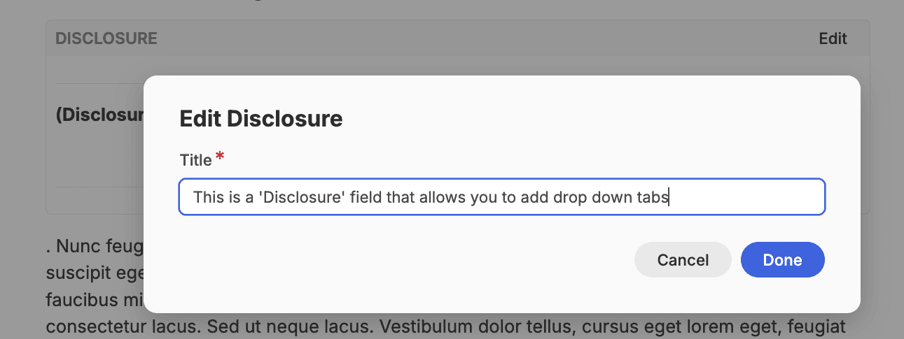
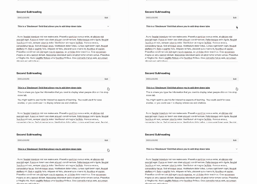
Once you have entered a title, you can then type directly into the text box below to add the additional information. Within the CMS you will be able to toggle the disclosure to open and close it, giving you an indication of how this will appear once it is published.
Embedding a Webpage
Sometimes it is useful to be able to bring in elements from other websites, particularly if their interactive elements are not currently compatible with the DARIAH-Campus architecture. An example of this could be Jupyter Notebooks, which cannot currently be integrated into DARIAH-Campus resources. A work-around for this could be to embed the webpage the Jupyter Notebook is published on, and allow learners to interact through that.
In this example we’ll use the DARIAH.eu website to demonstrate this.
Select the ‘Embed’ option from the widget dropdown menu. When you do this, a blank box with an ‘Edit’ button in the right hand corner will appear. Click on this, and a pop-up window will appear for you to type in the full URL (don’t forget the https://www bit!) for the webpage you want to embed.
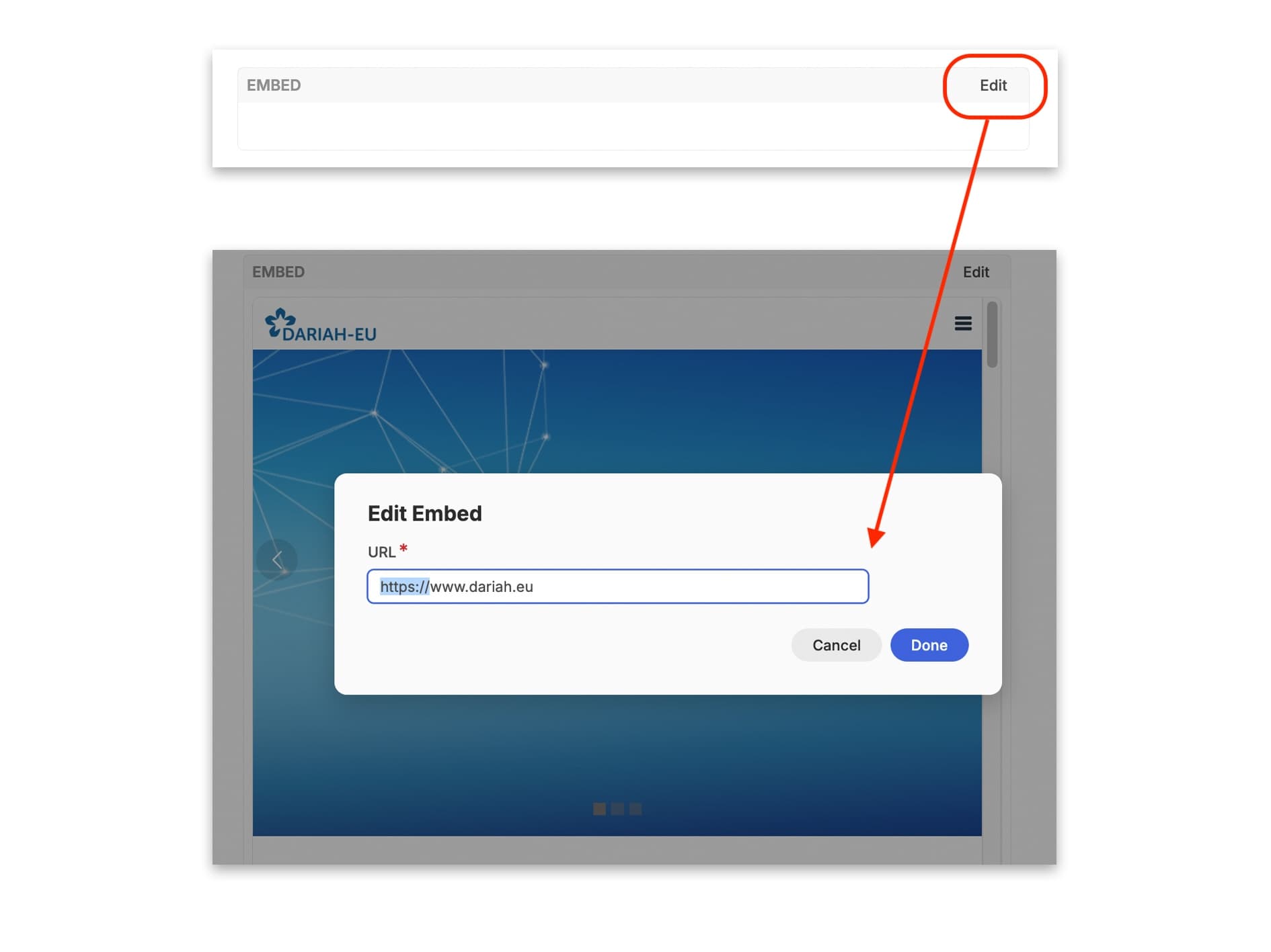
The webpage will then be displayed in that embed box. Click ‘Done’, and that’s it! If the webpage is quite long, a scroll bar will also appear on the right-hand side. When the resource is published, it will look almost identical to how it appears in the preview.
Figure
You may want to include images or infographics in your resource. This is also very straightforward. When you select the ‘Figure’ widget, a blank box appears on the page with an ‘edit’ button in the top-right hand corner. Click on this and it will open a pop-up window. You first click on the ‘Choose file’ button to open your computer’s file manager to find an image to add. A thumbnail of the image will be displayed below.
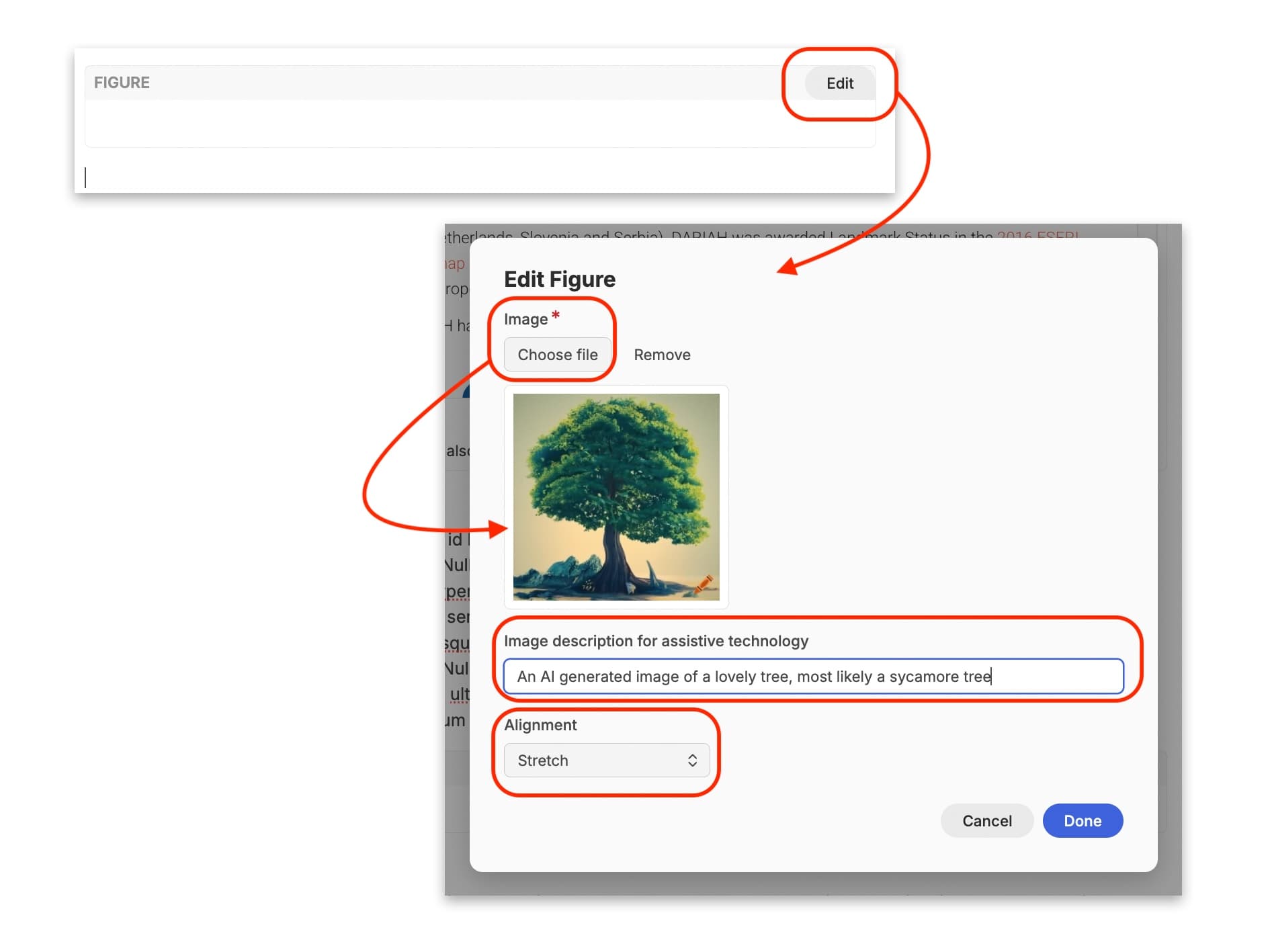
From here you can then add ‘Alt Text’ in the field for ‘image description for assistive technology’. While this field is currently not a required field, it is highly recommended that you add Alt Text to support screen reading technology. If the image is purely decorative, or is described and explained in the accompanying text in the resource, you can leave the field empty. For more notes and information on when Alt Text is required, you can visit the W3 Alt Text Decision Tree here: https://www.w3.org/WAI/tutorials/images/decision-tree/. For tips on writing useful Alt Text, we recommend taking a look at the AxessLab notes on writing Alt Text here: https://axesslab.com/alt-texts/
Finally, you can decide whether you want the image to stretch across the page, or to be aligned centrally.
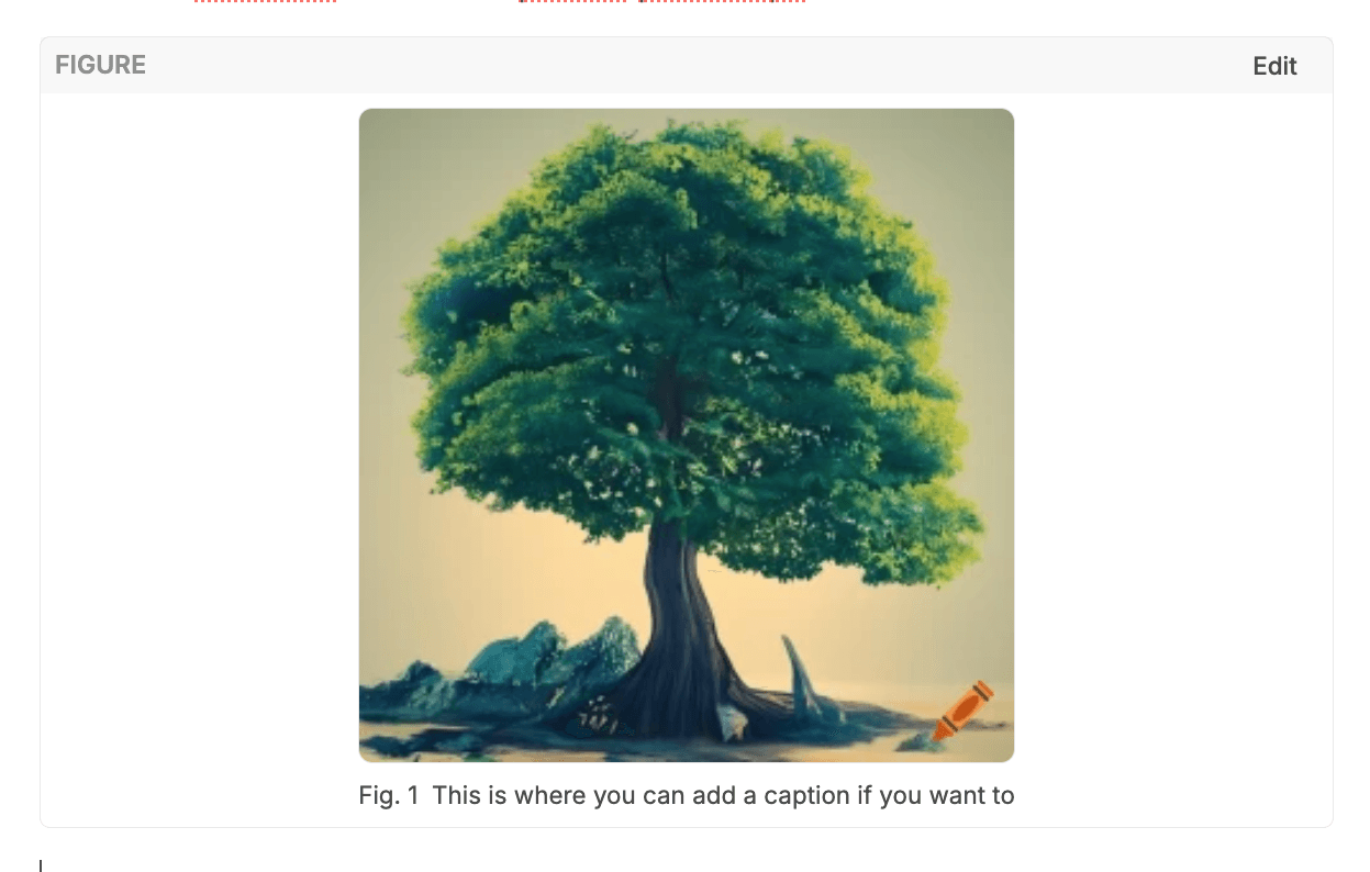
Once you have edited the image box, the image then appears on the page. You are then encouraged to write in a caption directly in the box underneath the image.
Image Carousel
If you want to display several images in a sequence, or a collection of photos without taking up too much space, then you can make use of the ‘Carousel’ option.
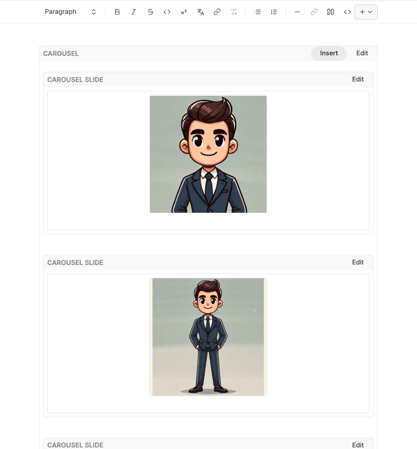
Selected ‘Carousel’ from the Widget dropdown menu. An editable box with a single ‘Carousel Slide’ box in it will appear. You can insert as many carousel slides as you need by clicking on ‘Insert’.
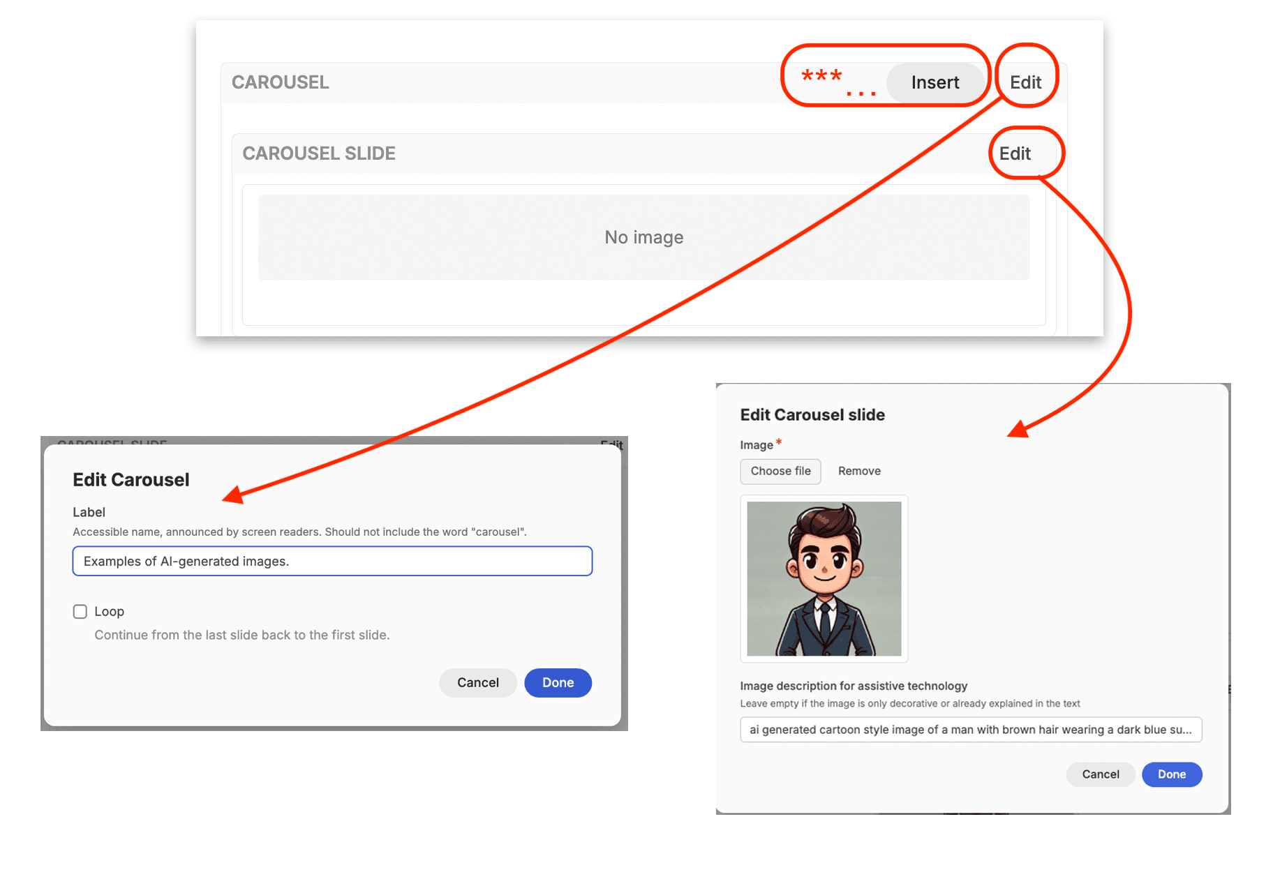
Click on the main Carousel ‘edit’ button to apply a screen-reader label and caption for the carousel. Don’t use the word ‘Carousel’ here, instead, describe what the carousel contains. In this case, we have gone with ‘Examples of AI Generated Images’.
Click in the ‘Loop’ checkbox if you want the images to be displayed in a loop when the learner clicks through them.
The ‘Edit’ button for each individual carousel slide allows you to add the respective image to that slide, and apply an image description for alt-text. Click ‘Done’ when you are finished. Do this for each individual carousel slide in your carousel.
Each of the slides will then be displayed in the editor within the main ‘Carousel’ box.\
When you publish this in your resource, the carousel appears as a single image, with the option to scroll through the rest of the images in both directions using the arrows underneath.
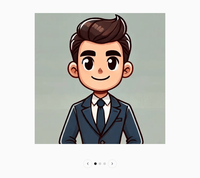
Image Comparison Slider
You might want to offer the learner the chance to compare two images. This is useful for historical photos of towns compared with modern images, or maps, for example.
To use this option, select ‘Image Comparison Slider’ from the widget dropdown menu. An editable box appears.
Click on ‘Edit’ and you will be invited to upload two photos for comparison. The order of images as they are uploaded determines their position on the slide, with the first image appearing on the left-hand side, and the second image on the right.
You will also have the option as to whether your comparison slider moves horizontally or vertically.
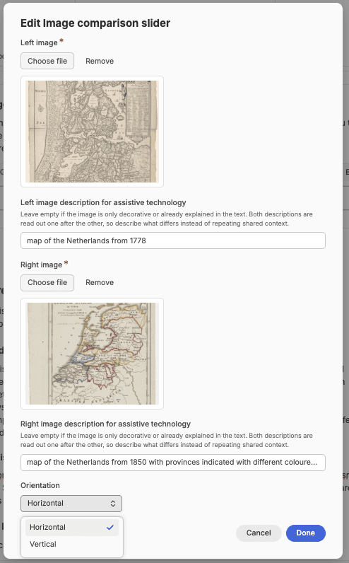
You will then see both images with the slide dividing them in the box in the CMS. You can move this slider left and right to check that the images look correct. Once you are happy, you can publish, and the finished version looks similar to that in the editor, with the user able to slide between the two images.
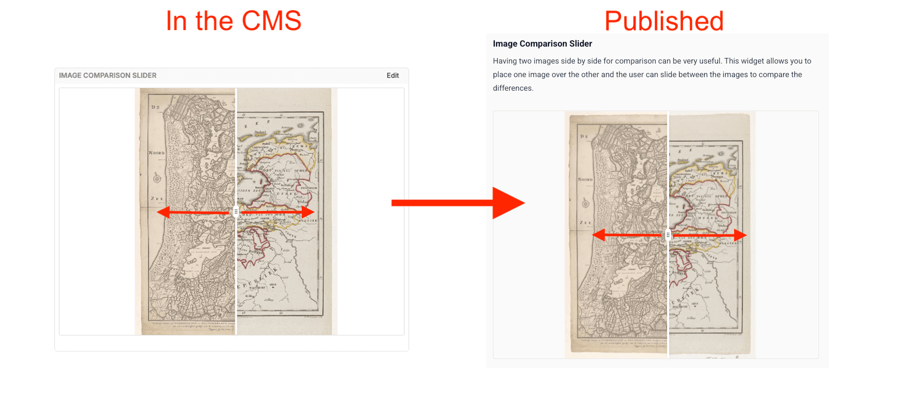
Image Layers
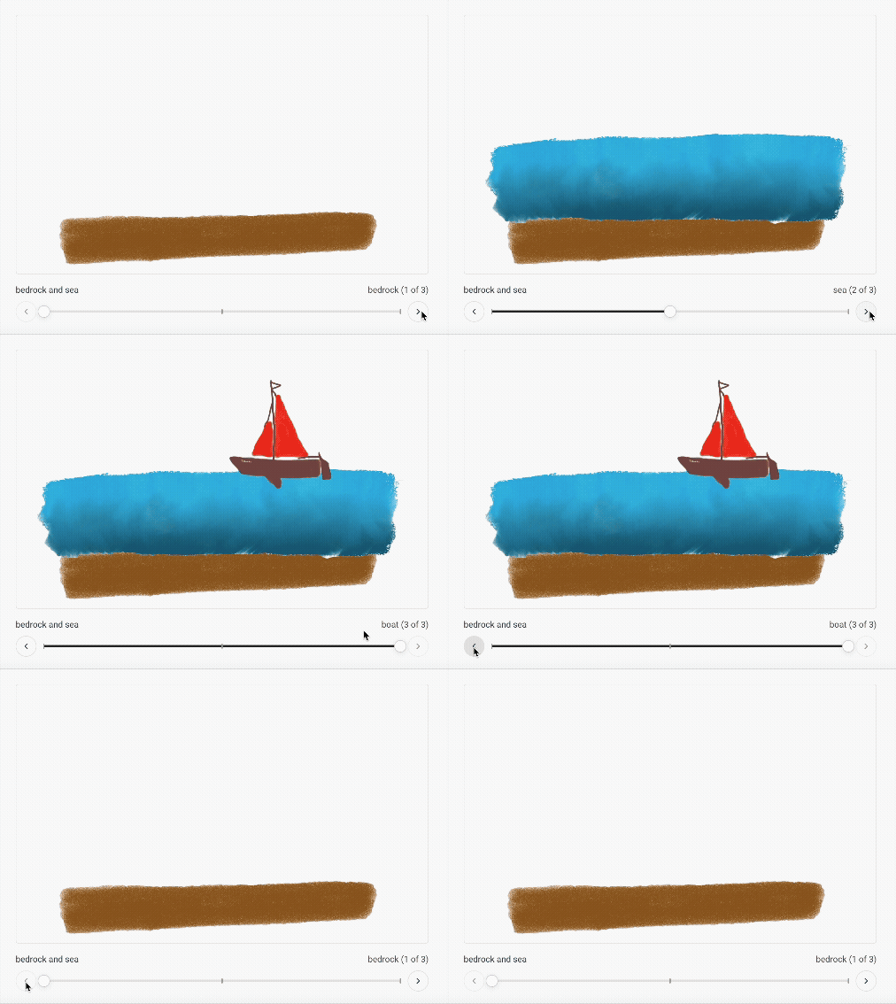
If you would like to demonstrate something using layers, you can use the image layers tool. This is similar to the carousel, but it overlays each of the images, so you can make use of sequential images to build up an overall image. You can do this using either .png images that allow for transparency so you can see parts of the layer below, or jpegs where each new image adds something to the previous image.
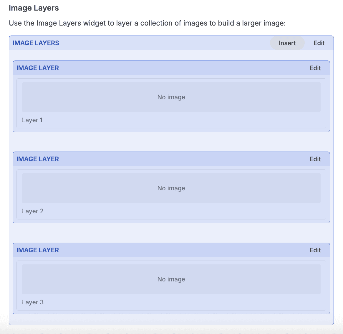
Select ‘Image Layers’ from the widget dropdown menu. The widget box will appear on the screen. By default it gives you two image layer boxes, but you can add more if you need them by clicking on ‘Insert’.
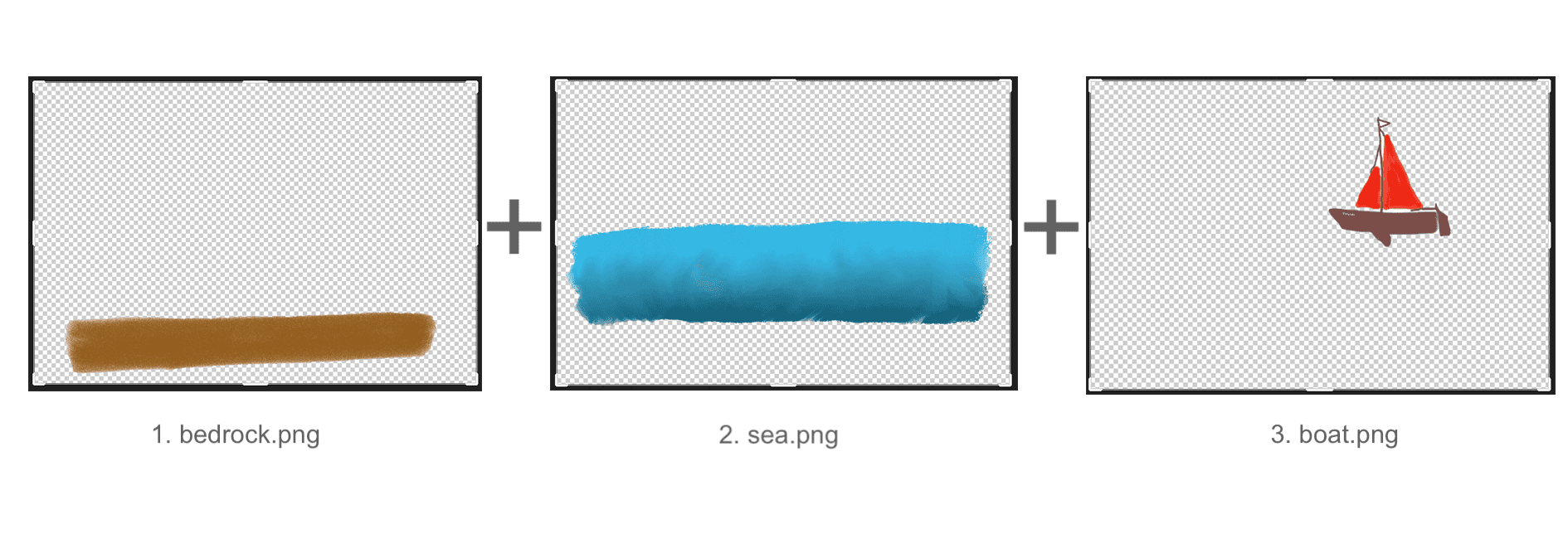
For this demo, we are going to use three .png files with transparent backgrounds. These are called ‘bedrock.png’, ‘sea.png’ and ‘boat.png’.
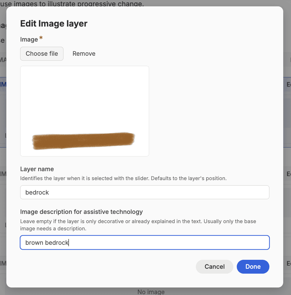
Add your images to each of the ‘image layer boxes’ by clicking on ‘edit’ in each respective box. A pop-up window will appear where you can upload your image. It will also ask you for a ‘layer name’ for this image, and an image description (alt text) to support learners with visual impairments
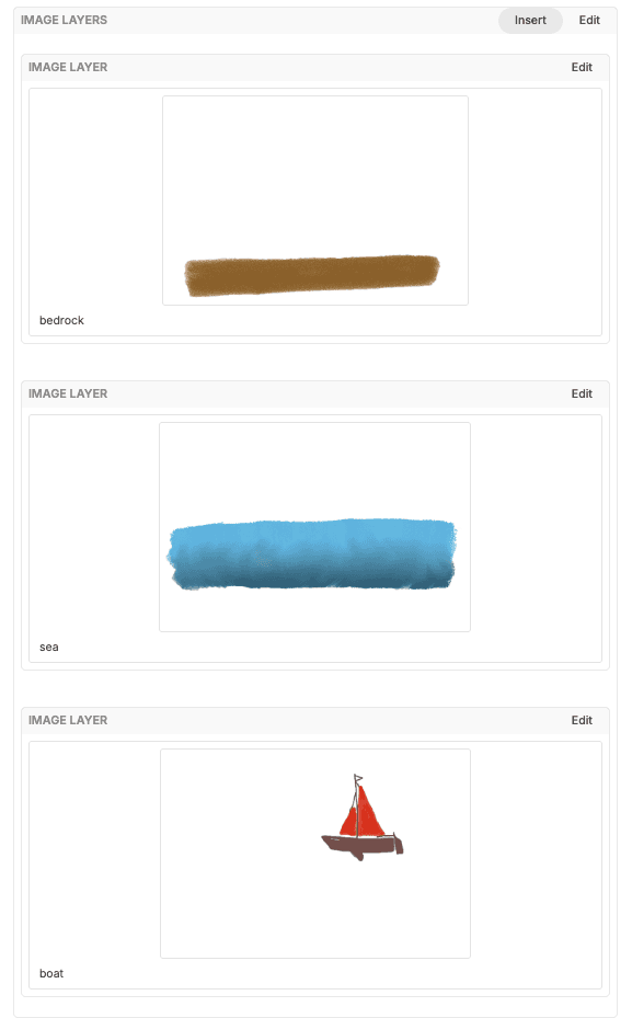
Do this for each of the layers of the stack. Once you are finished, you will see all the images in the ‘Image Layer’ widget along with their layer names.
In its published form, the user can scroll through using the arrows, and see the image build up using these individual layers that you have uploaded.
Adding a Grid Layout
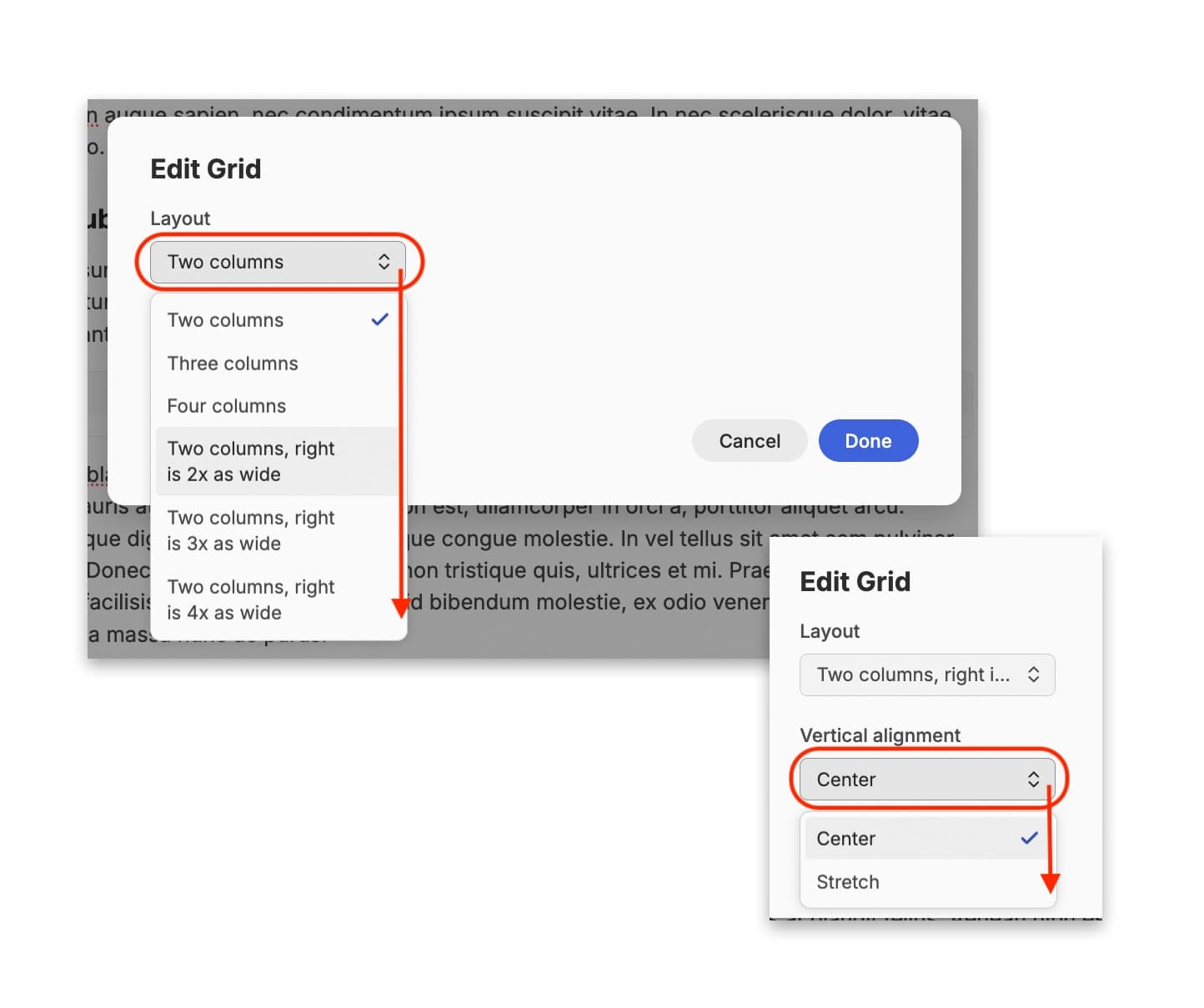
A grid layout offers an interesting way to present information, particularly if you want something similar to a table without having gridlines. Once you have selected the ‘Grid’ option, and clicked on the ‘edit’ button in the box, a pop-up window appears with two drop-down menus.
The ‘Layout’ drop-down menu allows you to pick how many columns and rows you would like, along with how wide you would like each column to be. The ‘Vertical Alignment’ drop-down menu determines whether text fills the cell it is in, or sits centrally within it.
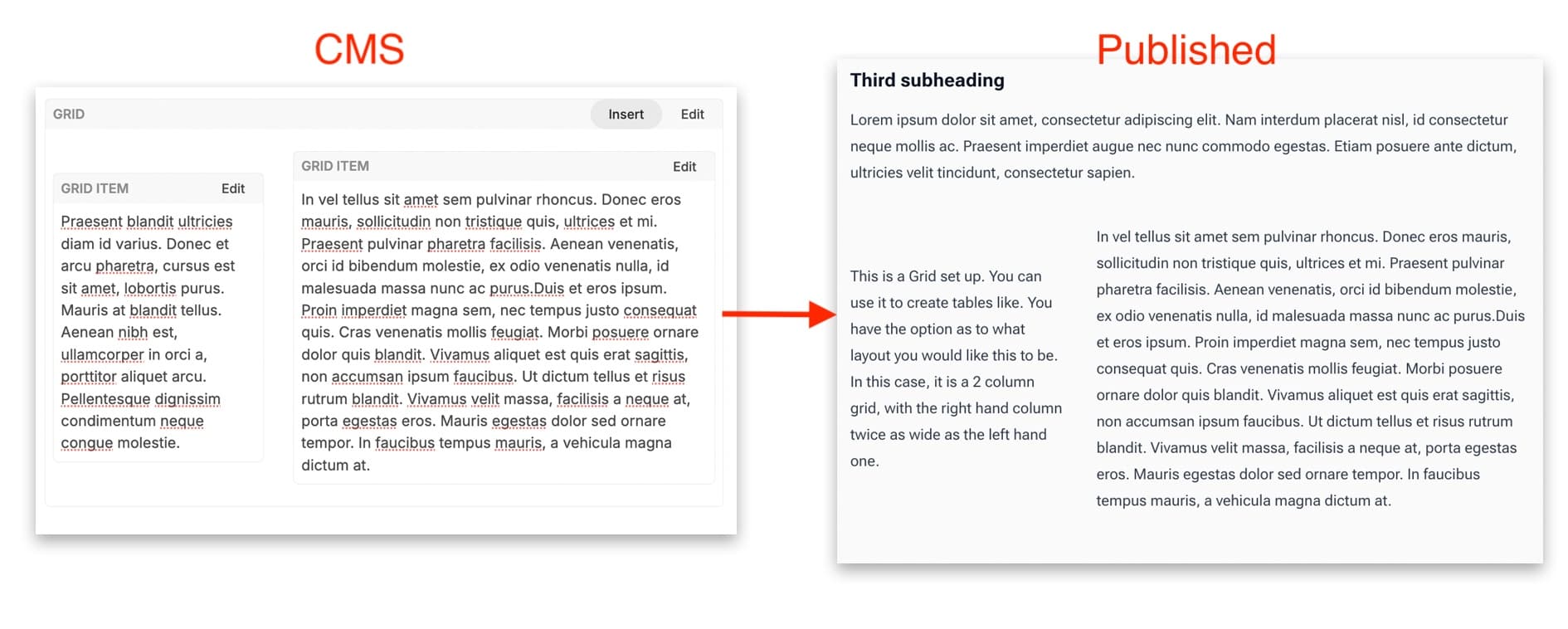
Once the layout has been fixed you can then ‘insert’ cells into your grid and then start writing in text directly to each new box. If you add to many cells, or grids within grids, you can click on the ones you want to delete to select them (turns blue), and tap your delete key.
Once published, the text will appear in the layout you determined, without any gridlines or boxes.
Heading ID
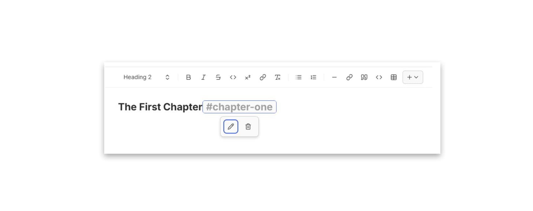
Each heading has an automatic heading ID based on the text used in that heading. For example, if you have a heading that says ‘Introduction’ then that becomes its heading ID. These IDs can be used to link to the different sections in the document, such as in a Table of Contents, or if you are adding a bookmark or anchor manually. Sometimes, you might want to change the heading ID to fit a format, for example, if the heading is too long to be a memorable URL fragment and you want to keep it simple. Heading ids should follow the pattern of lower case text with hyphens between words, for example:
Heading title: “Exploring AI in historical linguistics: The role of pattern recognition”
headingId: ai-in-historical-linguistics-pattern-recognition
Place your cursor next to the heading you want to alter, and click the ‘Heading ID’ option from the widget menu. A grey hashtag will appear. Click on the hashtag and select the edit icon (a pencil). This brings up a pop-up window where you can then type in the text you would like to appear in its URL. Once you have confirmed this by clicking ‘done’, the grey hashtag now shows the alternative title you have given this heading.
Link Button
A link button is a visually appealing way of adding a hyperlink or download option to your resource. Once you have selected the link button option, the blank box appears on the page. Click the edit button to bring up the pop-up edit window. You will see a drop-down menu labelled ‘Kind’ that allows you to determine what kind of item you want to link to (a direct URL, a download of a document, for example). Once this has been selected, you can then enter the URL for the item.
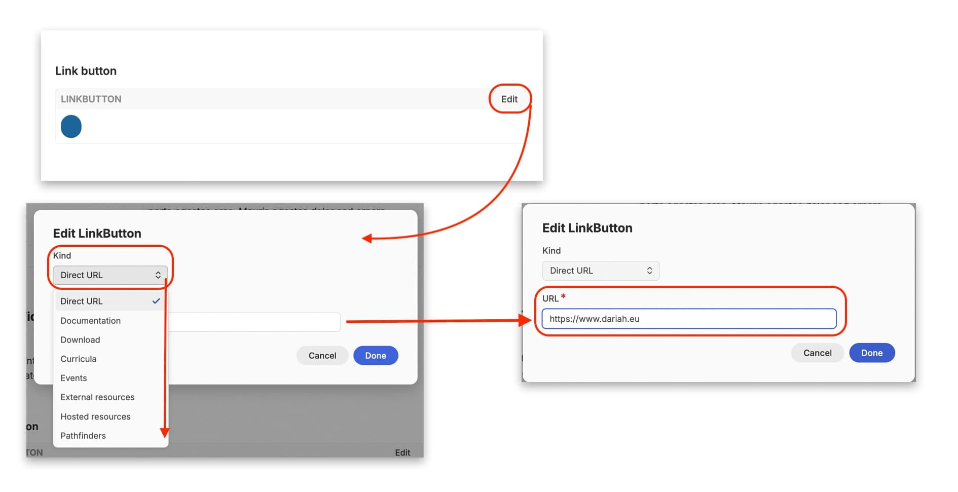
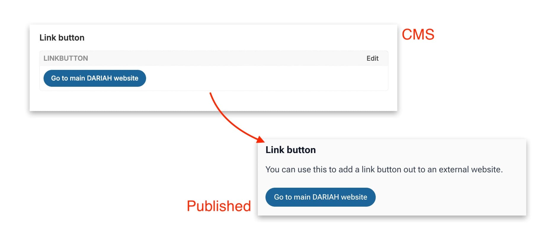
The link button now has a URL attached to it. You can then click in the link button itself to type in a title or a call to action such as ‘Click here to visit such-and-such website’.
Quizzes
The ‘Quiz’ option allows you to create a quiz or self-assessment either at the end of a section or the end of the entire resource. A quiz can contain multiple pages and mix multiple-choice questions, image hotspots, fill-in-the-blank exercises, and drag-the-words exercises. Learners use the previous and next controls to move through the pages.
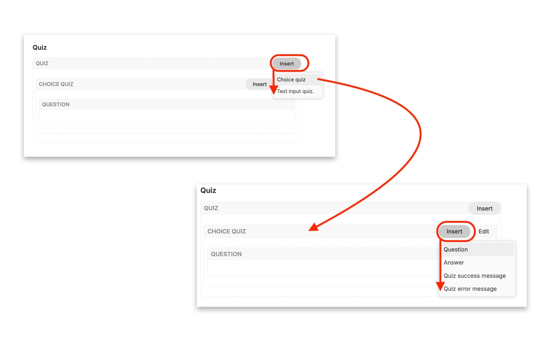
Once you have inserted a Quiz, use the ‘Insert’ button inside the quiz block to add the quiz type of your choice.
Multiple Choice Quiz
When you add a multiple-choice page, a box will appear with its own ‘Insert’ and ‘Edit’ buttons. Its ‘Insert’ menu provides four options: add a Question; give an Answer; write a quiz success message for a correct answer; or write a quiz error message for when the learner gets the question wrong.
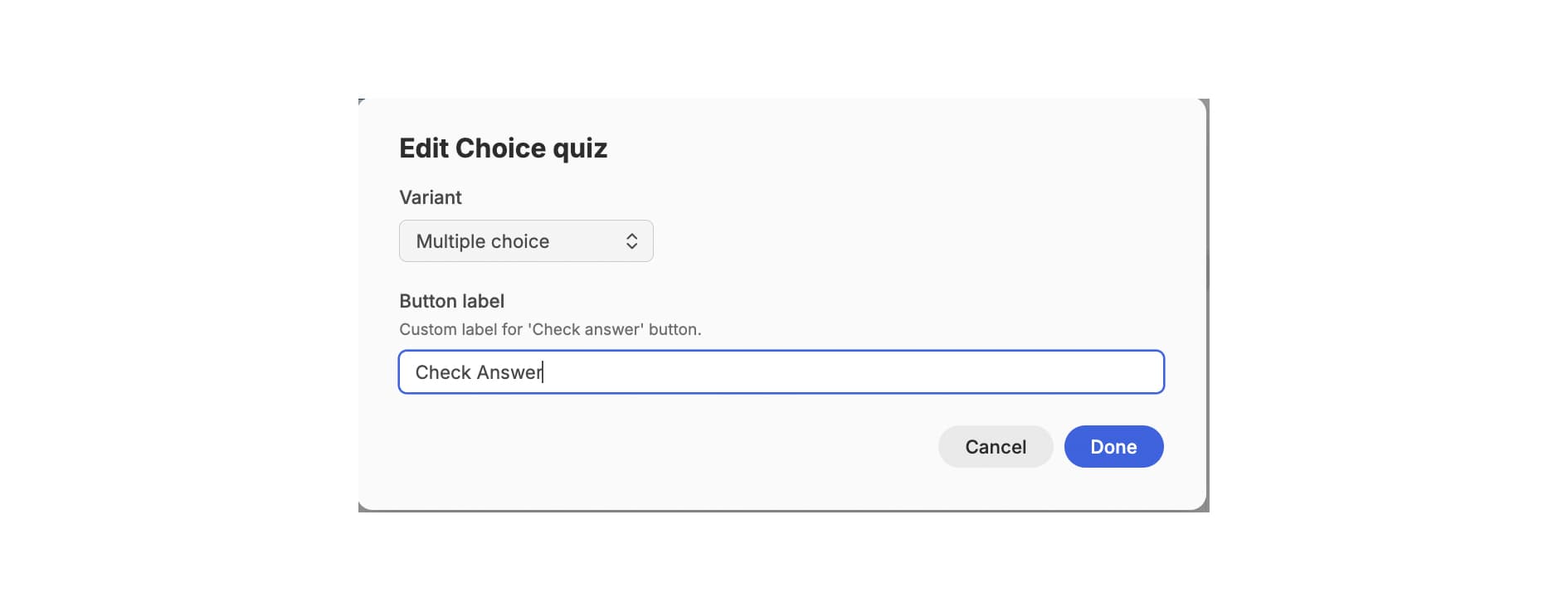
The ‘Edit’ button gives the option to specify what kind of quiz question this will be (multiple choice or inline text), and also to customise the ‘check answer’ button. In this case we are sticking with ‘check answer’, but you might want to add something else like ‘submit’, or ‘click here to check your answer’.
Once you have selected ‘Question’ from the Insert menu, you can then type your question directly into the box. You can then add as many ‘Answers’ from the ‘insert’ menu as you would like for your multiple choice quiz, typing the different answers into each individual ‘answers’ box. You can then use the edit button on each answer to identify which are incorrect answers, and which is the correct answer using the dropdown menu.
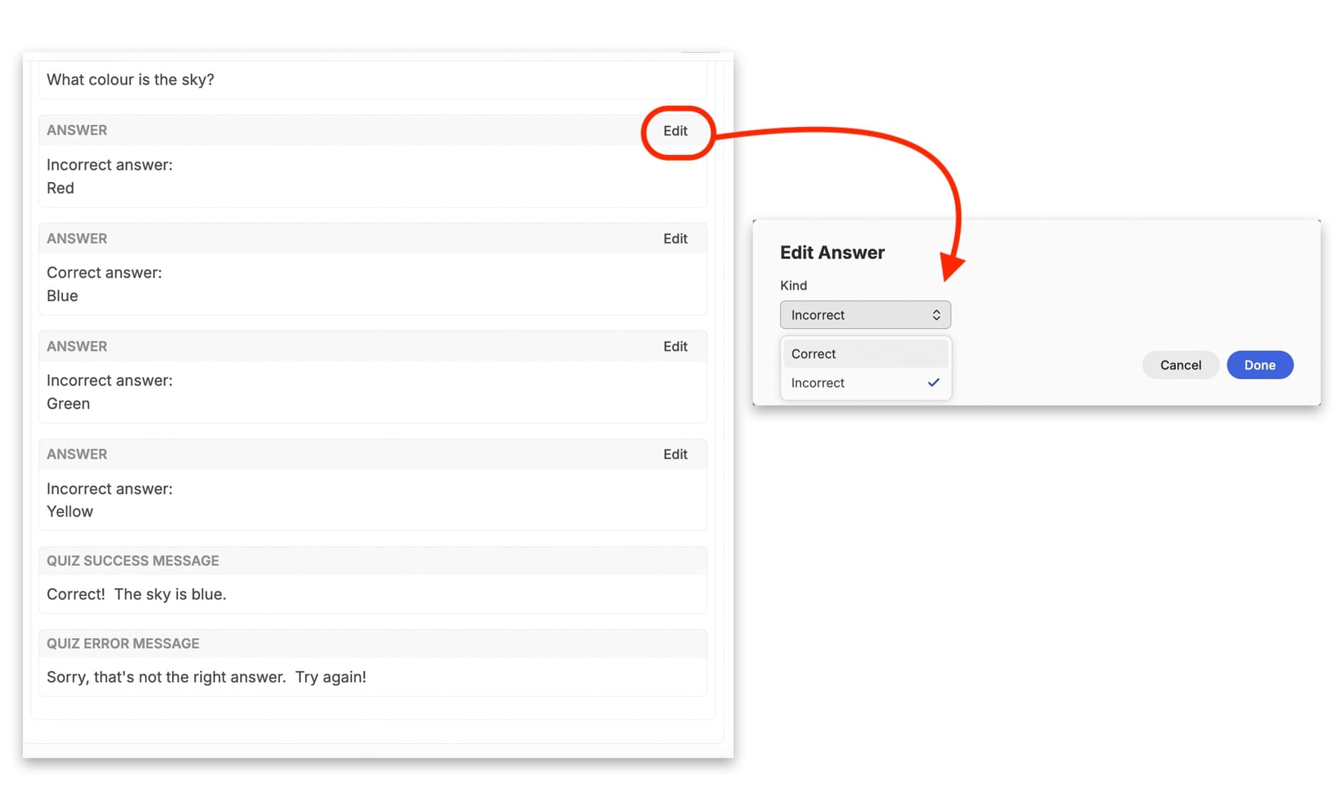
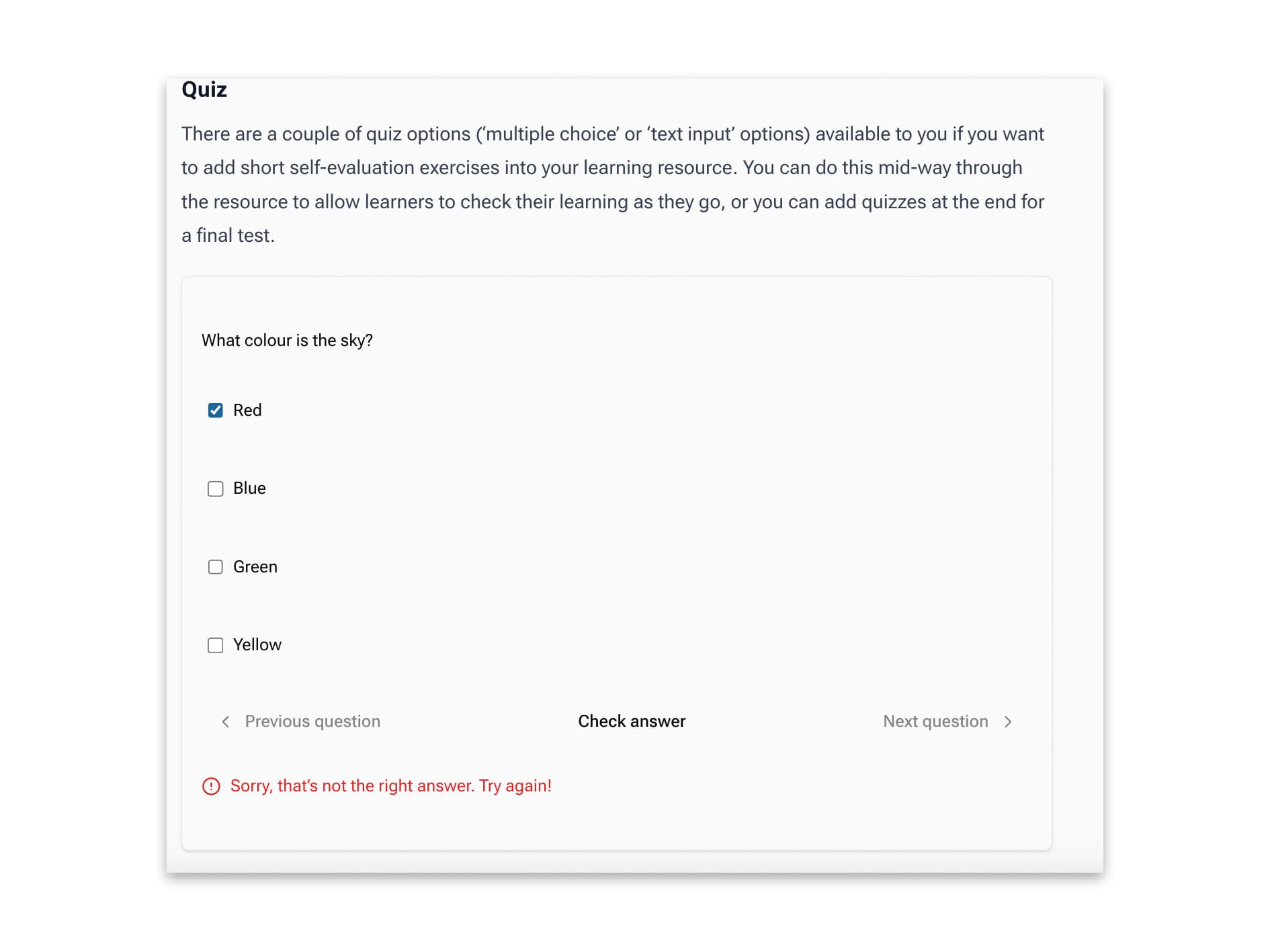
You can add a message to learners to indicate whether they have got the answer right or wrong. The published version of this will then show this message when the ‘check answer’ button (or whatever you’ve chosen to call it) is clicked.
Quiz - Fill in the blanks
The ‘Fill in the blanks’ interactive quiz option allows you to text learners’ knowledge by having them fill in the missing words from a statement. For example “The colour of grass is [BLANK]’ and the learner would type in their answer and check to see if they have got it right.
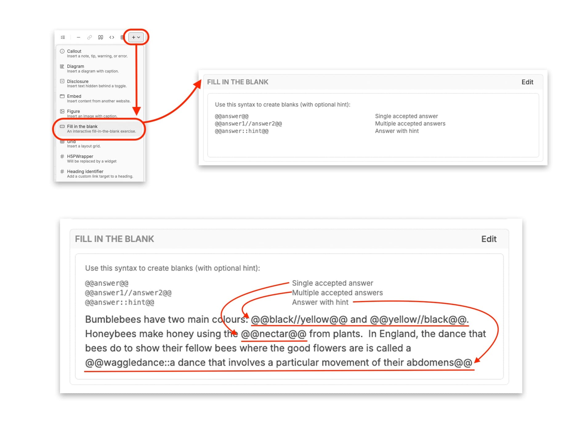
To add a ‘Fill in the blank’ exercise, insert a Quiz from the Widget menu, then select ‘Fill in the blank’ from the Insert menu inside the quiz. An editable box will appear with some guiding information for how to give the correct syntax for the different options. Those different options are:
- Single accepted answer (syntax: @@answer@@)
- Multiple accepted answers (syntax: @@answer1//answer2@@)
- Answer with hint (syntax: @@answer::hint@@)
You can make the answers case sensitive if necessary by clicking on the ‘edit’ button and selecting this option.
For the ‘Single accepted answer’, you simply replace the ‘answer’ with the correct answer, e.g. The colour of grass is @@green@@.
For ‘Multiple accepted answers, you replace the different numbered instances of ‘answer’ with the correct answers. This is useful if you know that there is some ambiguity in the correct answer, e.g. “@@John Lennon//Paul McCartney//Ringo Starr//George Harrison” was a member of The Beatles”.
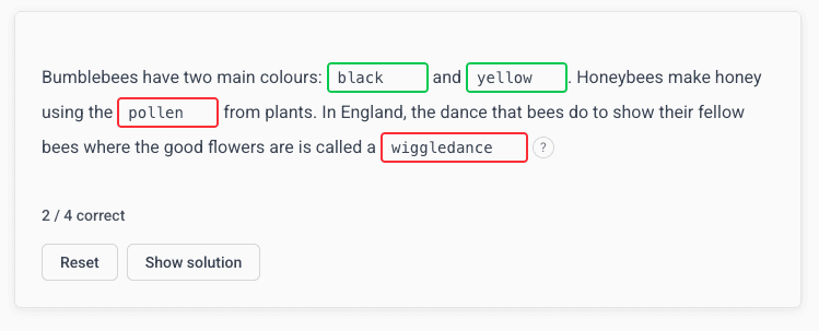
You can also combine this function if you want the learner to list all the possible right answers. For this, though, you will need to change the order in which the answers appear in the syntax, e.g. “Bumblebees are often striped in two colours: @@black//yellow@@ and @@yellow//black@@”. This is because the widget will pick the first option in each syntax field when giving the learner clicks on the ‘Show Solution’ button.
If you want to add a hint to an answer, you can do so using the ‘Answer with hint’ syntax. Here you give the correct answer, and then type in a hint after the double colons, e.g. “Bees will do what is known as a @@waggledance::a dance that involves a specific movement of their bums@@”. This will then give the learner an option to view a hint if they need one.
When published, you will then see that each of these syntax fields has been turned into a box that learners can type directly into. If you have added a hint, this will show up as a question mark in a circle that learners can click on to see the hint.
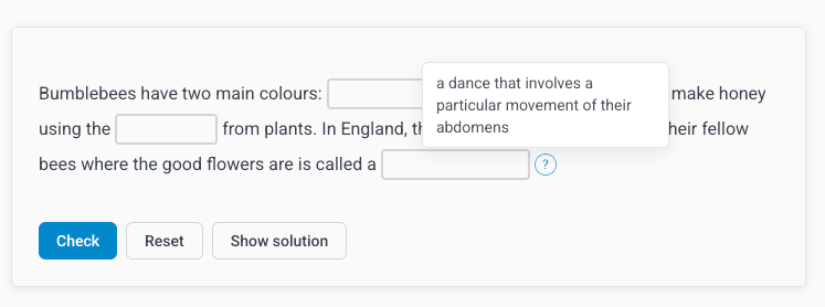
Once learners have filled in their answers, they can then click on the ‘Check’ button to see how they’ve done. Correct answers will be outlined in green, while incorrect answers will be outlined in red.
Quiz - Drag the Words
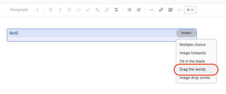
Select the ‘Quiz’ widget from the widget dropdown menu. You will then see a box appear in the CMS. If you click on ‘Insert’, a further dropdown menu will appear with the different quiz options. Select ‘Drag The Words’.
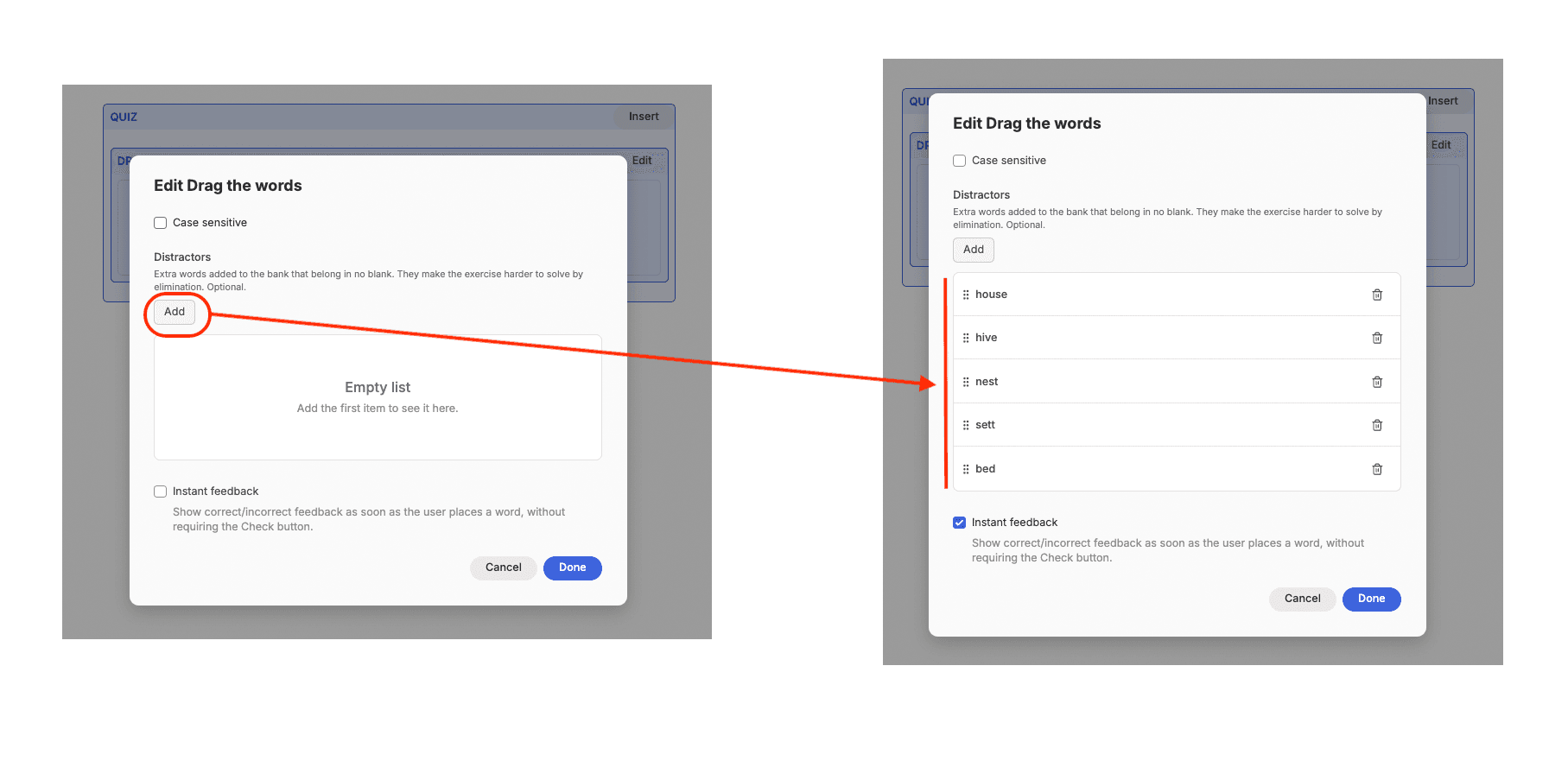
The box will change to show a text box with some sample text in it. If you click on the ‘edit’ button, a pop-up window appears where you can will see a check box to make the responses case sensitive, the option to add ‘distractor’ words (wrong answers), and another check-box to allow learners to get immediate feedback when they attempt the quiz.
Here we have added in a series of wrong answers to the unfinished sentence ‘Bees live in a…’. Once you have finished adding your ‘distractor’ words, click on ‘done’.
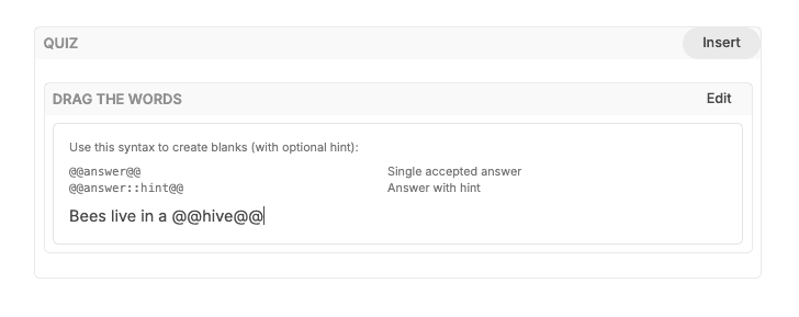
You can now begin drafting up your question (you can do this before you add your distractor words as well, of course). The syntax you need to use is demonstrated in the quiz box. Essentially, you can type out your sentence that you want the learner to complete, and then for the blank space, you use the correct answer surrounded by “@”, so the layout looks like this:
“Bees live in a @@hive@@.”
You can also add a hint for learners as well, by adding a double-colon and then the hint, structured as:
“Bees live in a @@hive::sounds like ‘five’@@.
When the quiz is published, learners will be able to click on the hint option and see this hint text.
The published version in the finished resource then shows a box where the sentence with the blank space appears on the left, and all the options, both correct and incorrect, appear as draggable words on the right-hand side. The learner clicks on their chosen word, and drags it over to the blank space which will turn blue.
If you ticked the checkbox to enable immediate feedback, the blank space will immediately turn red to indicate a wrong answer, or green to indicate a correct answer. If you didn’t select this option, then the learner can click on ‘Check’ to see how they did.
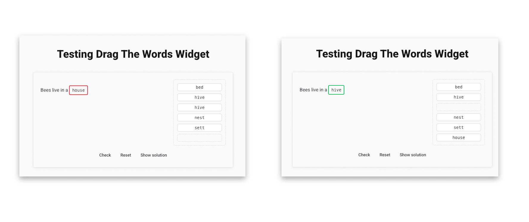
Image Dropzone Quiz
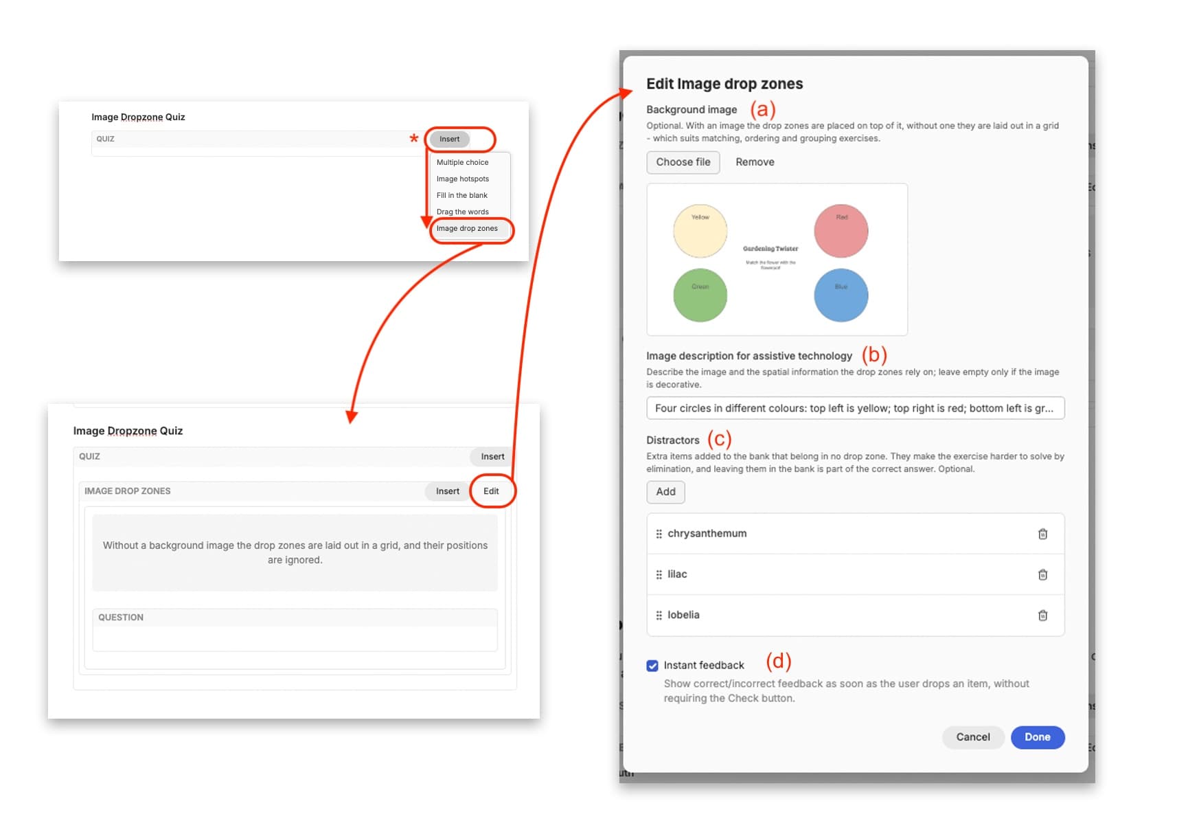
Learners can use the Image Dropzone quiz to match words by dragging words over to a ‘dropzone’. Select the ‘Quiz’ widget, and in the ‘Insert’ dropdown menu, select ‘Image Dropzone’.
A box will appear showing a space for an image, and a box for a question. Click on the ‘edit’ button. This will bring up a pop-up window where you can: (a) Add a background image for your quiz that the dropzones will be drawn over; (b) provide an image description (alt text) to support learners who use a screen reader; (c) add optional ‘distractors’ - purposefully wrong answers to make the quiz a little bit harder if you want to challenge your learners, and; (d) determine whether or not you want to give learners instant feedback by checking the option box.
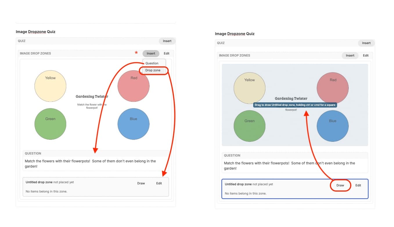
When you click on ‘Done’, the image will now be displayed in the ‘background image’ window. From here, you can start to add your ‘dropzones’ to the image. Click on ‘insert’ and select ‘image dropzone’. An editable ‘Untitled drop zone’ box will appear with the options to ‘draw’ a dropzone and then edit it. Click on ‘draw’, and you will then be able to draw a rectangle by clicking and dragging the mouse over the part of the image you want a dropzone to sit in. If you want this to be a perfectly square shaped dropzone, you will need to hold either the ctrl key (Windows) or cmd (Mac) while you drag your mouse.
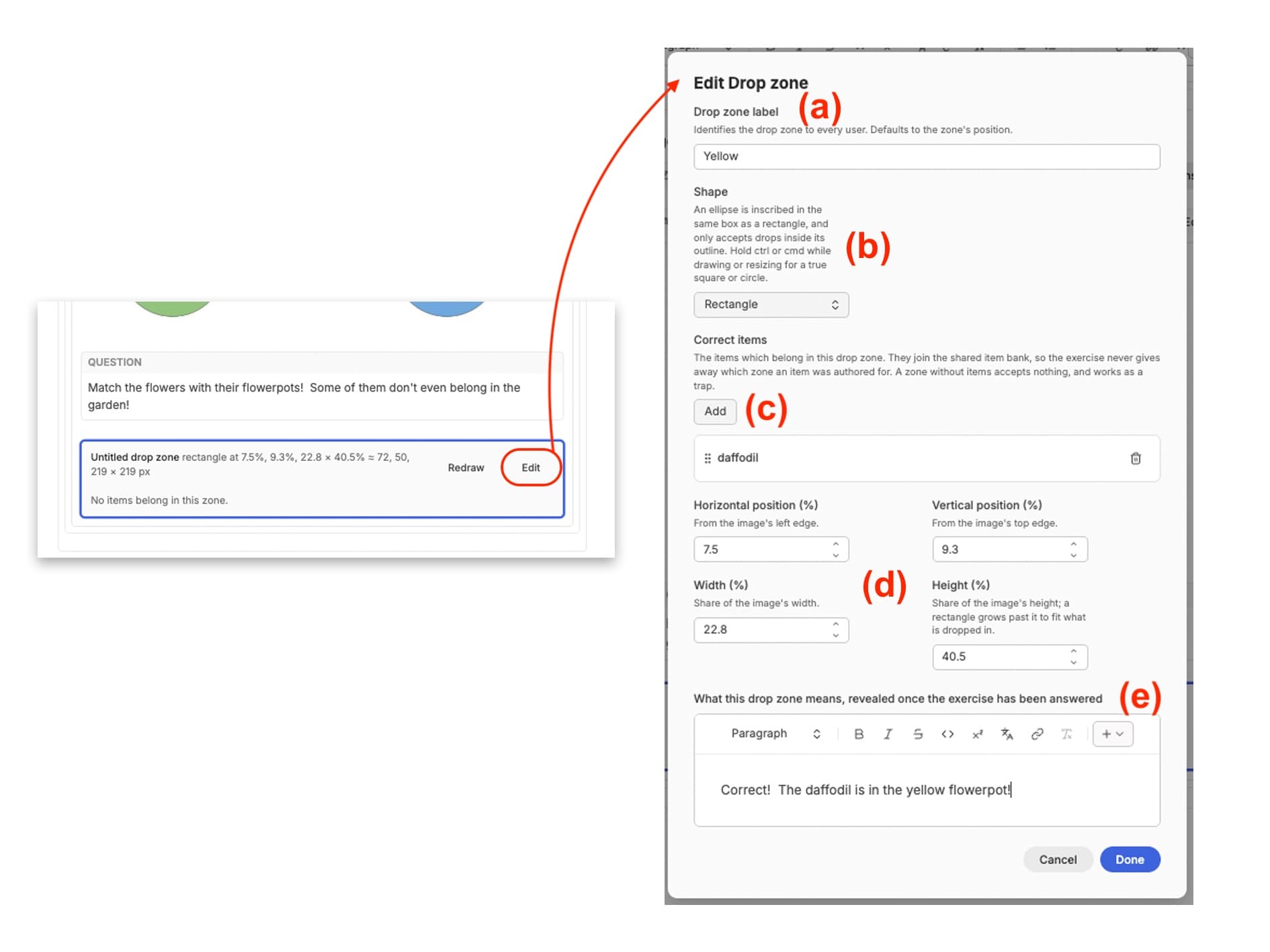
Click on the ‘Edit’ option for your dropzone, and a new pop-up window will appear. Within this window, you will be able to: (a) give the dropzone a meaningful label which will be provided as an option for screenreaders; (b) decide if the shape of the dropzone will be a rectangle or an ellipse using the dropdown menu; (c ) define the correct answer for this dropzone. You can add as many correct answers for this dropzone as you like; (d) determine the position and dimensions of the dropzone through its horizontal and vertical position, and defining the height and width; and (e) provide some text for the learner to understand what the dropzone means, which is revealed once the exercise has been answered.
Do this for as many different dropzones as you want to create. When you’ve finished adding and editing all of your dropzones, you will see them listed underneath the background image and question box. You can also redraw individual dropzones without having to re-enter the dropzone information again by clicking on ‘Redraw’.\
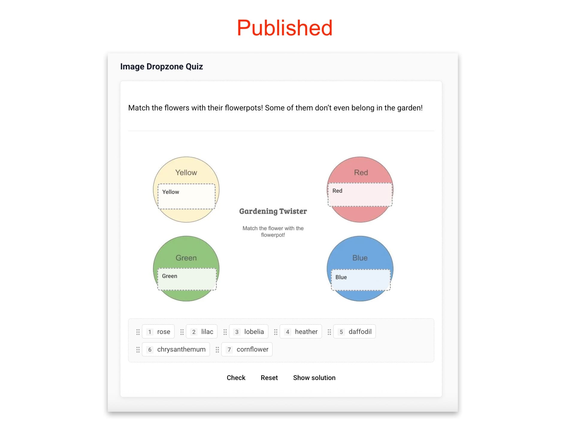
In the published version, the image is displayed with the dropzones, and the options for answers are presented as moveable tiles underneath. The learner can either drag the word tile into the dropzone, or select the dropzone by clicking on the wordtile and the dropzone labels will appear for the learner to choose from.
Split Point
If you have a Learning Resource that is extremely long, you might want to break it down into ‘pages’ or sections for your learners to make it easier to read, and feel less overwhelming. For example, this ‘Using the Content Management System’ documentation has been ‘split’ into sections to make it easier to find information about the widgets and formatting options relevant to the resource type of your choice.
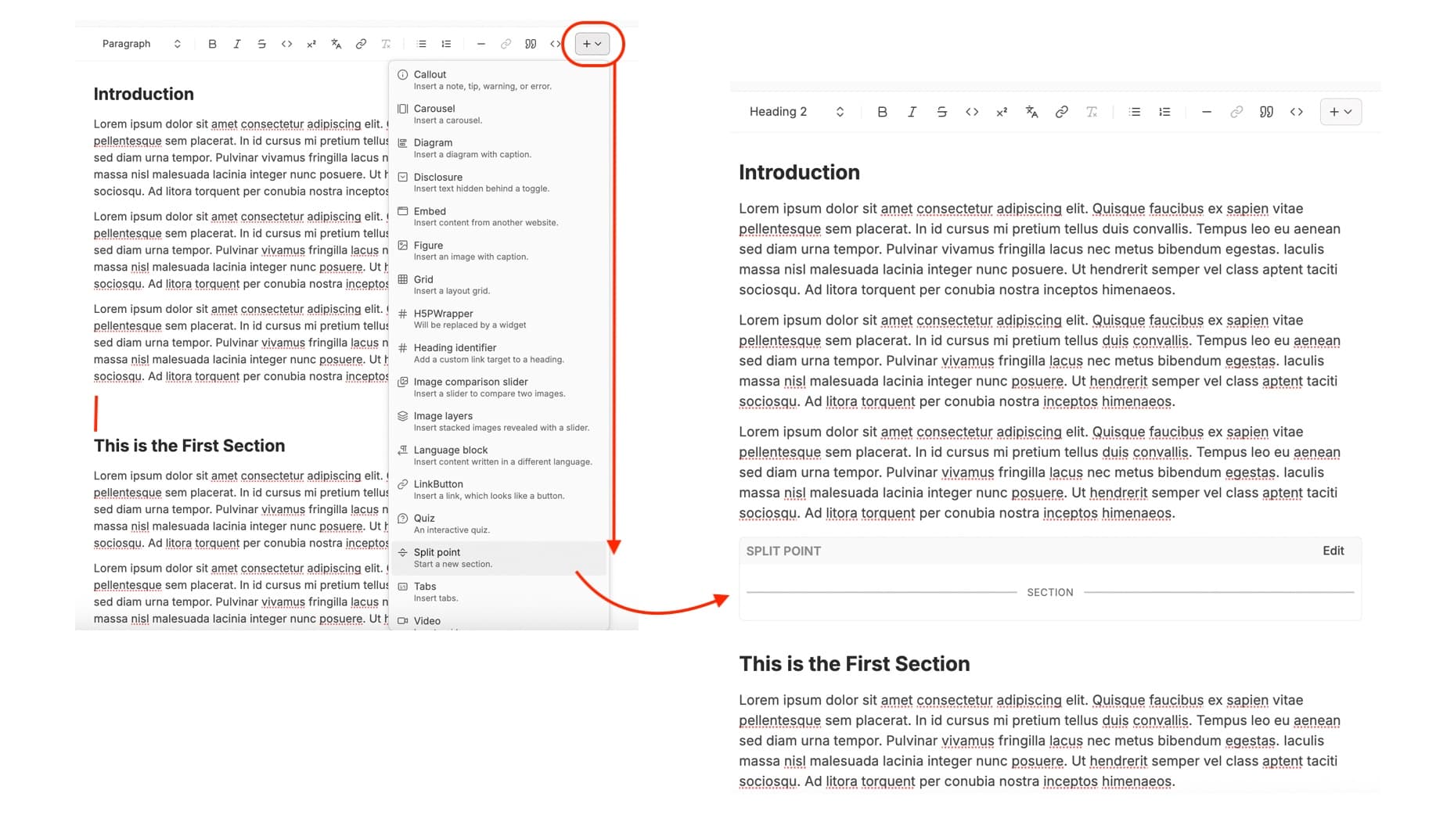
To add a split, click into the area in your Learning Resource where you want to insert a split, and select ‘Split Point’ from the widget menu. Do this for as many different sections as you feel makes sense for your resource.
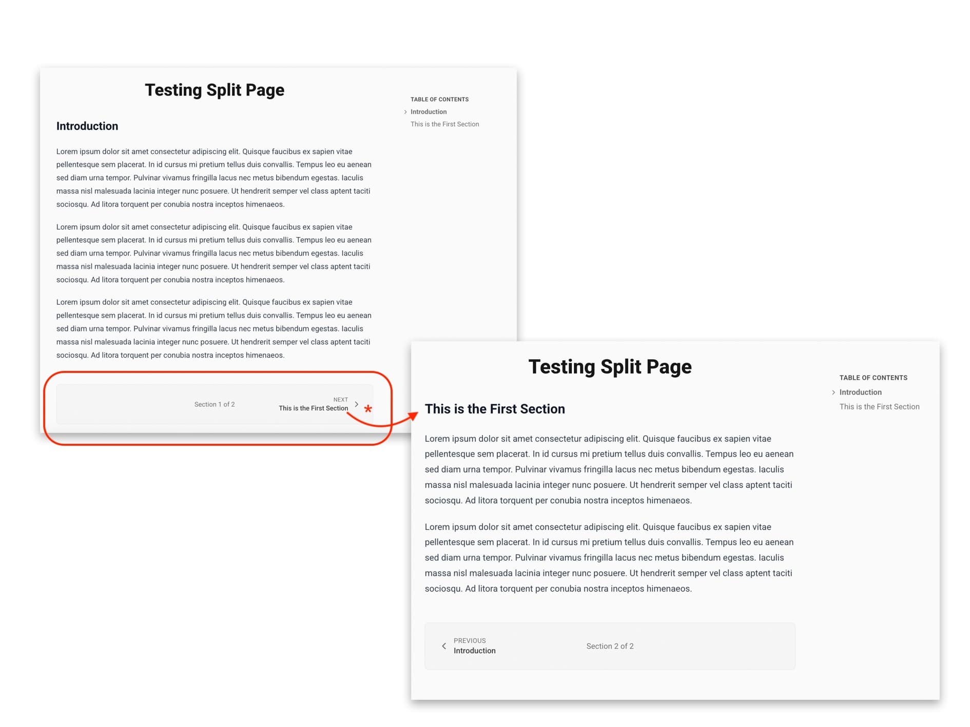
In the published version, the resource will be split into different sections or pages, and at the bottom of each page, there will be a navigation panel that allows the learner to go back and forth to the previous section or page. These are titled according to the nearest ‘Heading 2’ to the Split Point.
Note that the Table of Contents remains complete regardless of which ‘page’ a learner is on, so that they can easily navigate between different sections.
Tabs
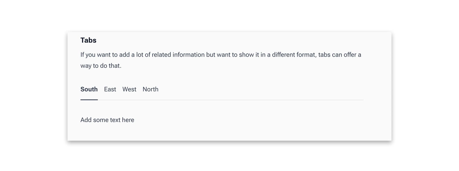
Tabs offer a different layout for text, particularly if that text is related in some way. They work in a similar way to the ‘disclosure’ option in that they can reveal text, but more than one tab can be added to a block.
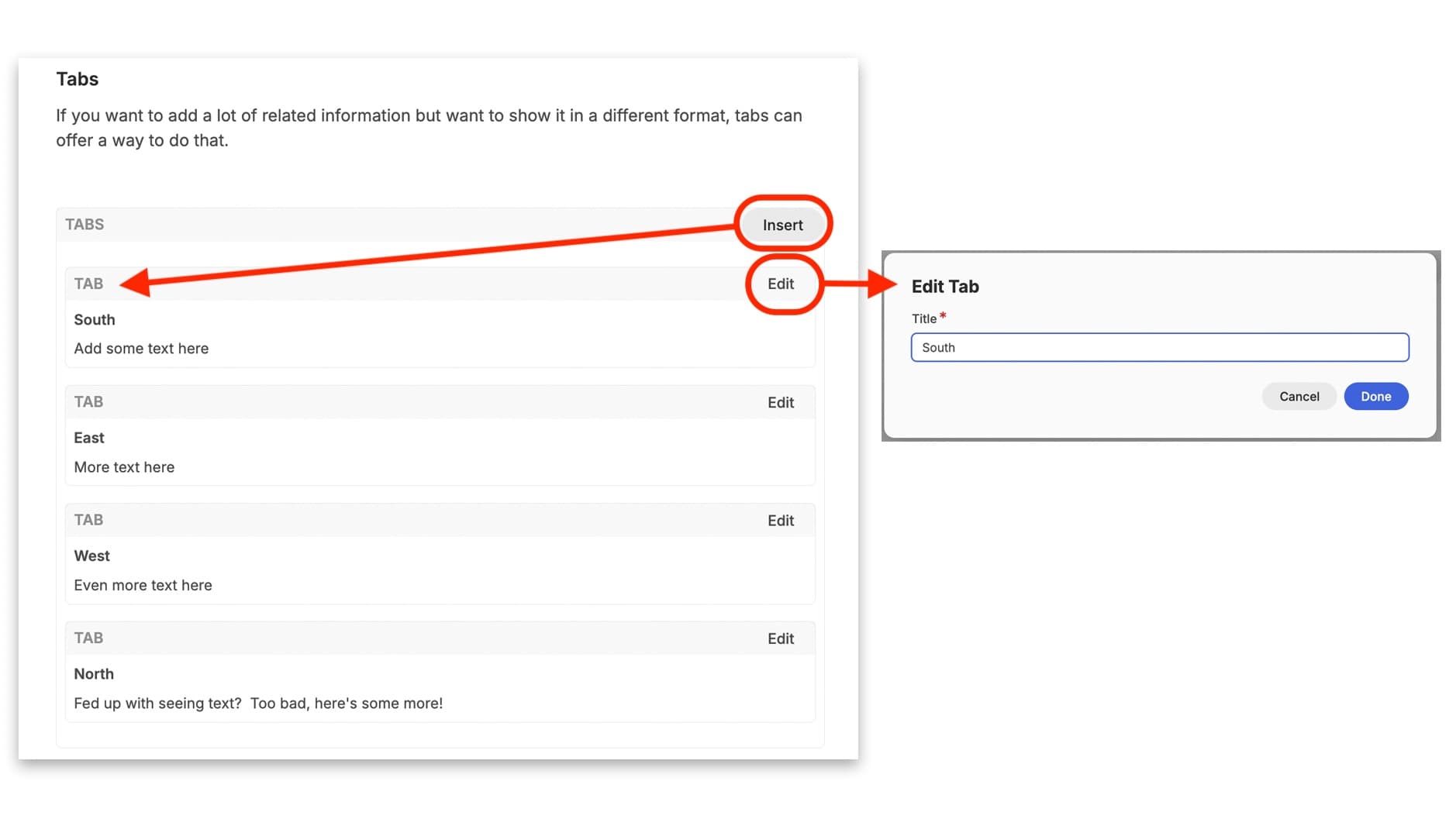
After you click on the ‘Tabs’ option, the box appears on the page. From here you can use the button on the right of the box to ‘Insert’ as many tabs as you would like. These all appear below as individual tab boxes. In each tab box, you can then click the ‘Edit’ button to give each tab a title. From there you can then enter the content you want to include in each tab by typing directly into the box underneath its title.
When this is published, the tabs all appear lined up horizontally, and are clickable to reveal the text.
Video Card
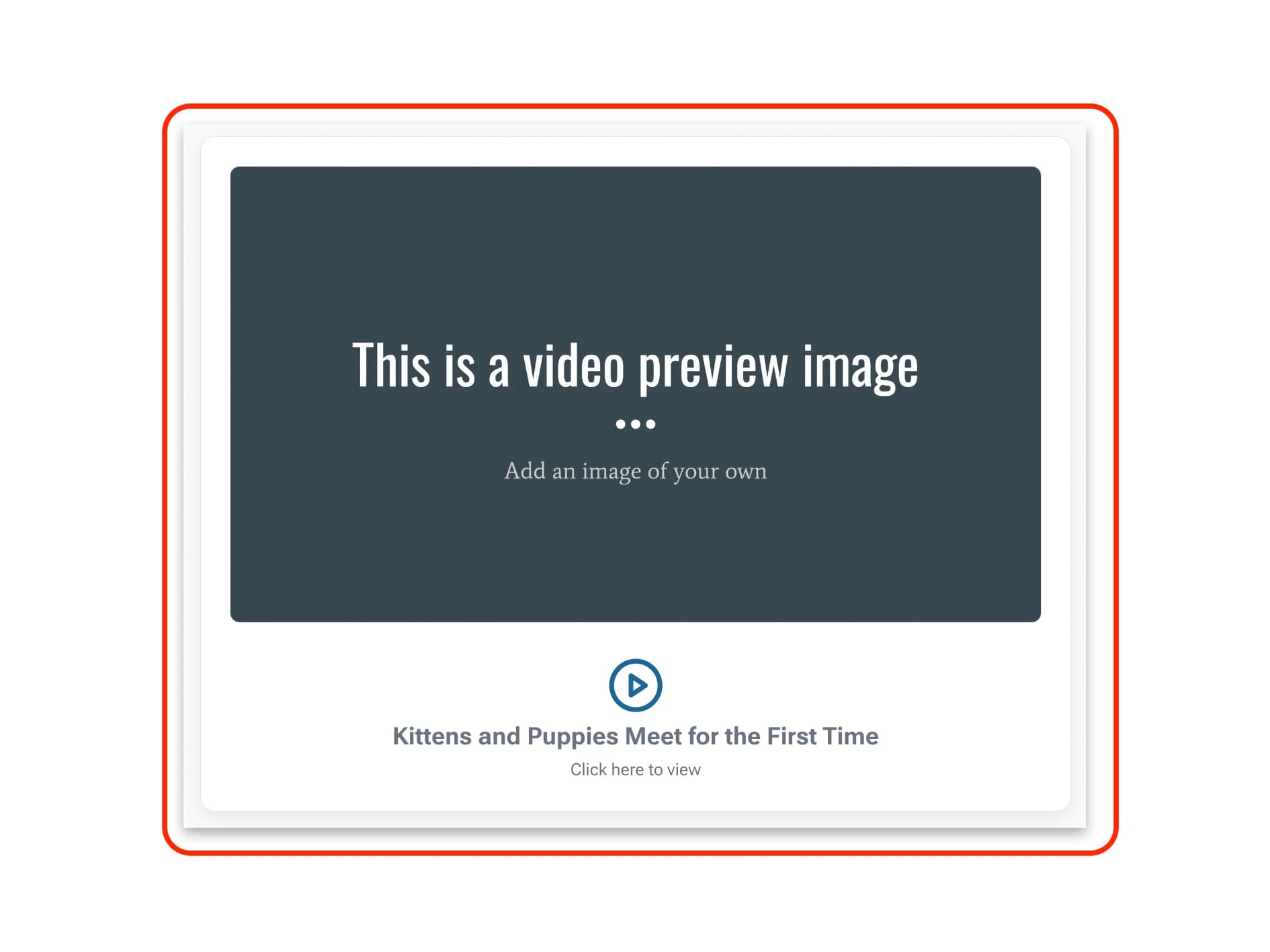
There are two options for adding videos to your resources. The first shown here is the ‘Video Card’ option. This allows you to add some brief contextualising text and then links out to a video. When this is played, the video will expand to fill the screen.
Locating the Video ID on YouTube videos
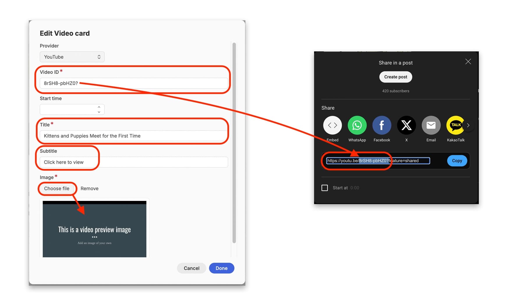
You can add videos from four specified video content providers: YouTube, Vimeo, Nakala, and the University of Helsinki, as shown in the dropdown menu when you click to ‘Edit’ the video card. In most cases, videos come from YouTube. Whichever video publishing platform you choose, you will need to find the video ID. This is usually shown as an alpha-numeric code at the end of the main url. Copy and paste only this code into the ‘Video ID’ field. In the case of Nakala, the ID is a much longer code, and this can be copied directly under the video you want to publish:

Copying and pasting the Video ID for videos on Nakala
You can also specify a start time in the video if there is a certain section you want to showcase.
You are asked to provide the title of the video, and a subtitle. The ‘Title’ should be the same as the title of the video on its hosting video platform. The subtitle, though, can be a call to action; we recommend ‘Click here to view’.
You are also asked to add your own thumbnail image for this video card. You can do this by clicking ‘choose file’ and selecting an image from your computer. This image is then displayed as the main card for the video in the published version.
Video
The ‘Video’ option is a bit different to the ‘Video Card’ option as it allows you to embed a video within the content of the resource you are writing. This is particularly useful if you are creating a new ‘Hosted’ resource directly on DARIAH-Campus, and want to embed a video to illustrate or demonstrate an issue or provocation.
In the ‘Edit’ box of your video field, first select your video host (YouTube, Vimeo, Nakala or University of Helsinki). You will also be asked again for the video ID. The ‘Video ID’ can be found usually at the end of the URL for the video. In the case of YouTube, for example, this is typically around 11 or so characters in length, usually made up of alpha-numeric characters and symbols. If you have a specific start-time in the video that you want people to see, you can enter that in the ‘Start time’ field.
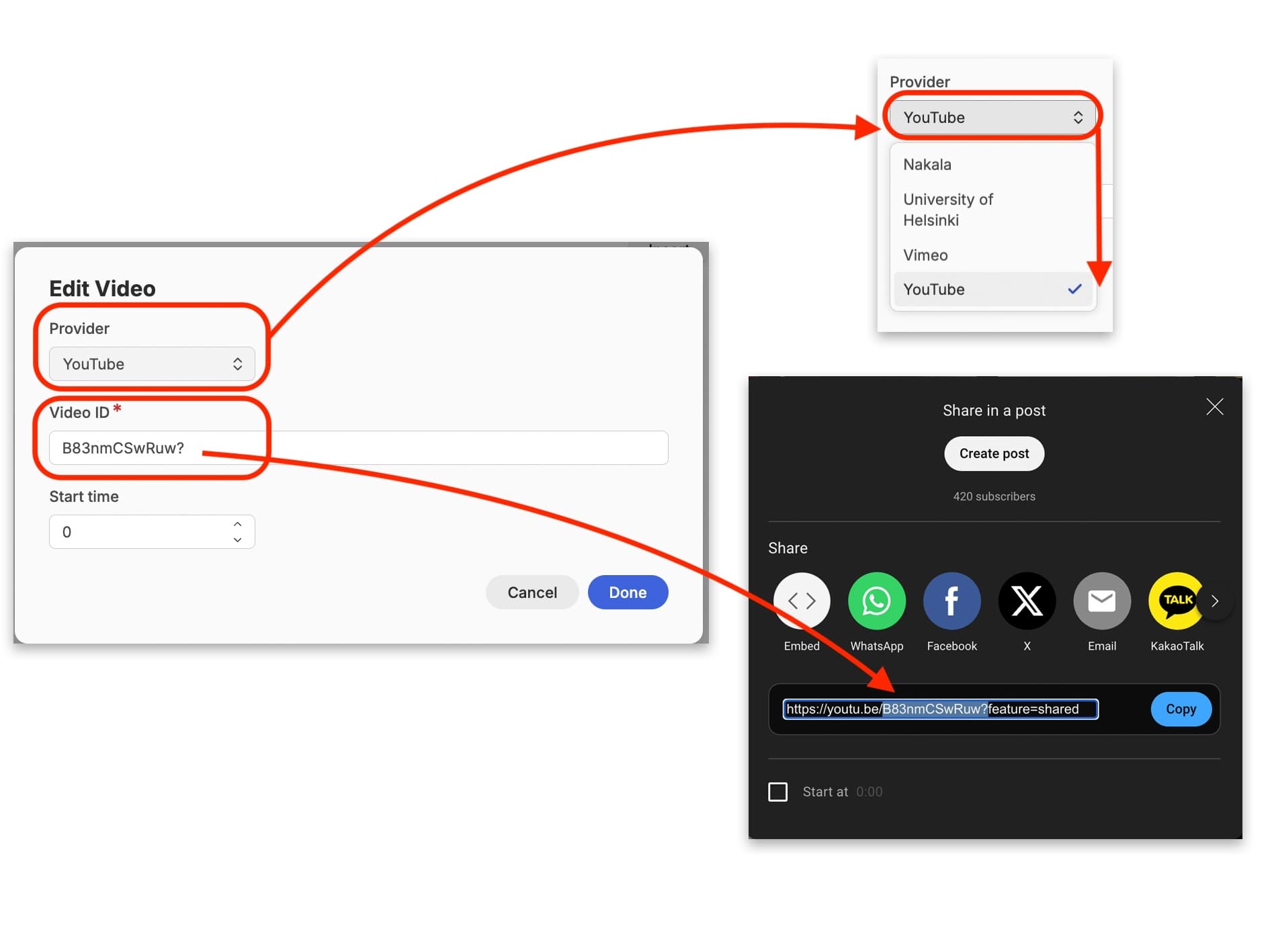
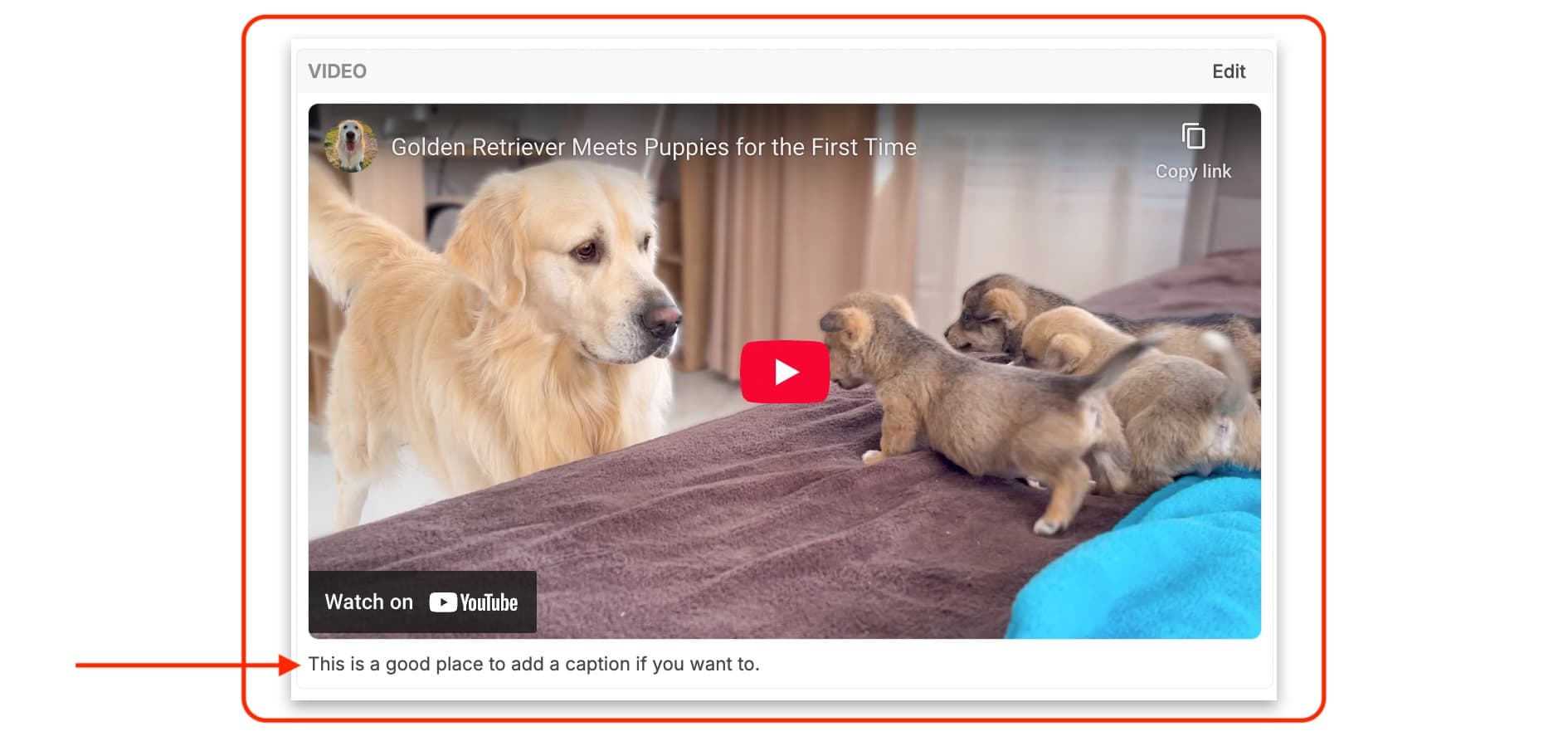
Once you have entered all this and clicked ‘Done’, the video thumbnail will appear in the ‘Video’ box. You can type a caption for the video directly underneath to let users know what they are looking at.
Worksheet
You can create a worksheet that learners can edit in the learning resource and then download for their own records. This is great to enable learners to take notes, and also to take some of the information away for printing out, or just storing locally on their computer.\
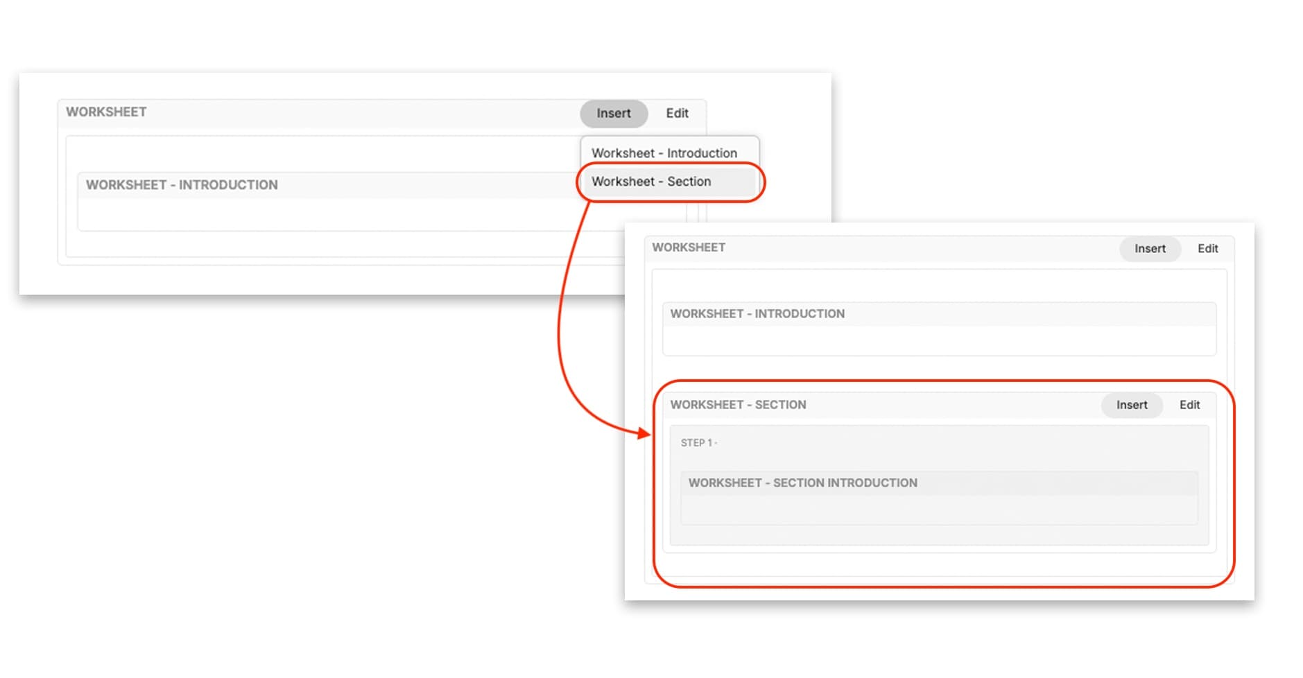
Select ‘Worksheet’ from the widget menu. An editable box will appear, with an ‘Introduction’ field included. You can click on the ‘Insert’ button to add a new section to the worksheet, which also automatically comes with a section introduction. You can directly type into these ‘Introduction’ fields to add information about how learners should fill out the form.
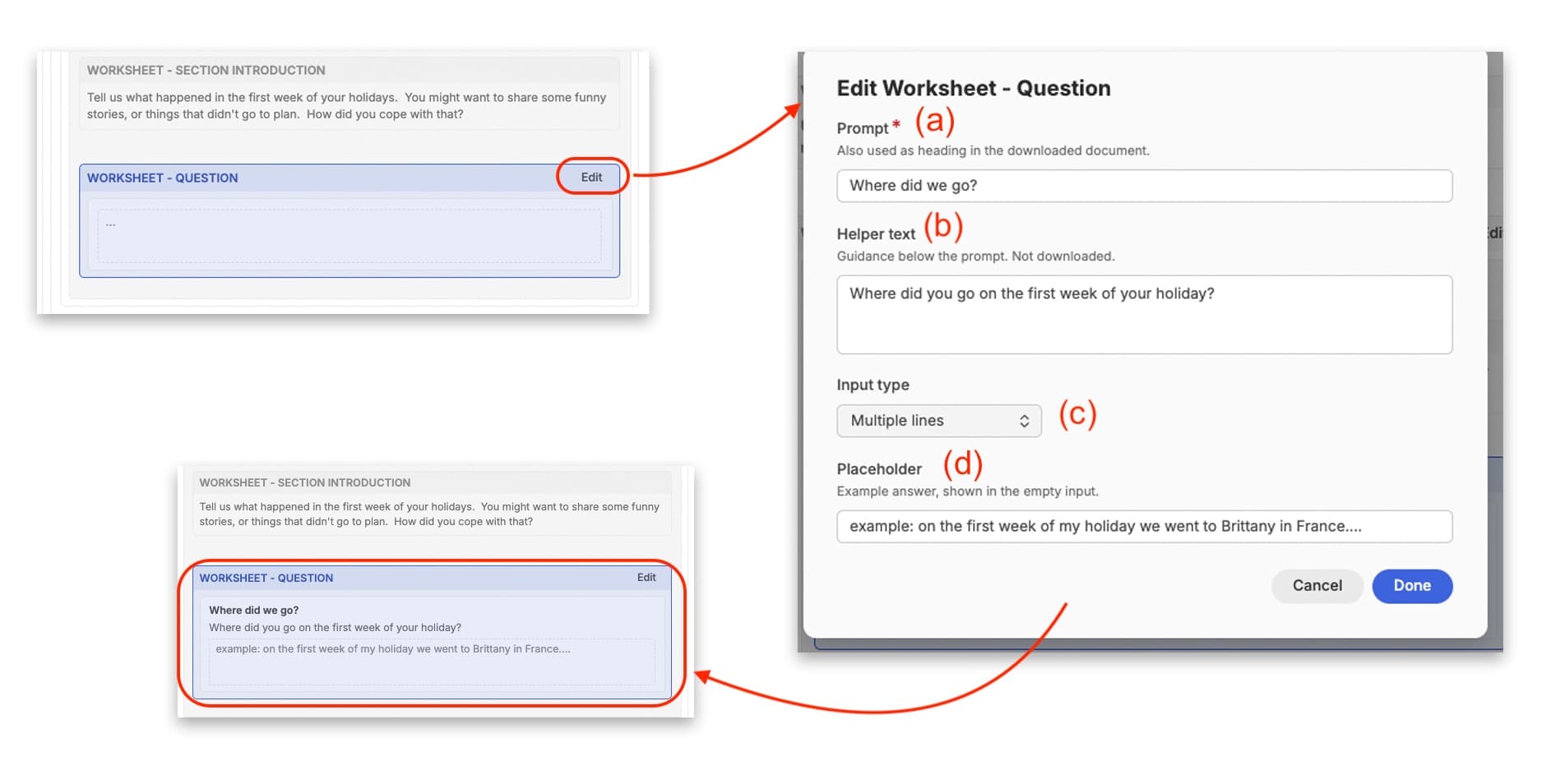
You can edit this worksheet section by clicking on the ‘edit’ button and give it a section heading. You can also add questions to this section by clicking on the ‘Insert’ button here. Once you have your question box in place, you can click on its edit button to (a) define the prompting question, (b) provide some helper text, (c) use the drop-down menu to determine if the space allowed for a response is a single line, or allows for multiple lines, and (d) provide an example ‘placeholder’, Click on ‘Done’ and these edits will then appear in the question box.
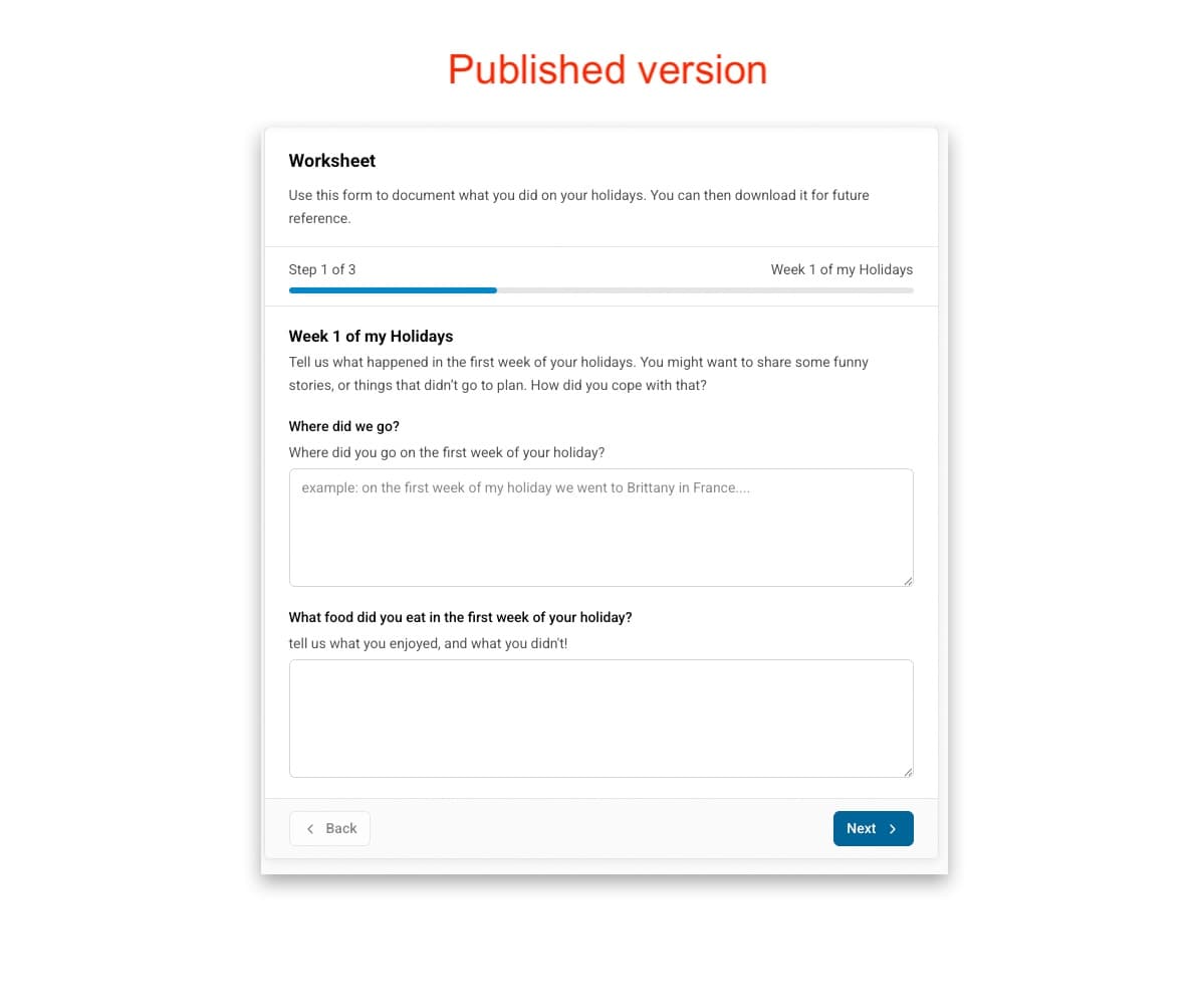
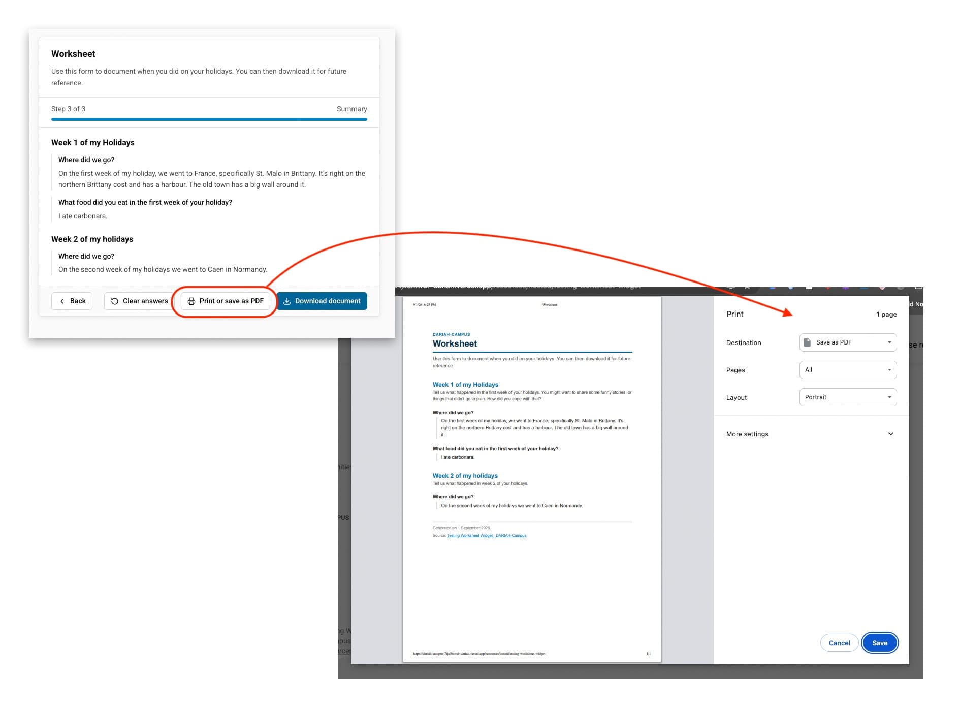
You can continue in this manner to add new questions and sections to build up your worksheet. Once it is published on DARIAH-Campus, you will see that learners can fill out this worksheet within the resource, working their way through the different sections.
Once they have completed the form, they will be given the option to print the form as a hard copy or a PDF, or to download and save the form to their computer.
Remember to save your work as you go along!
Saving your Hosted Resource draft
After doing so much work, you may wish to ‘Create’ a pull request, and save your work. You can of course do this at any point in the editing process once the required metadata has been entered. Exactly when you choose to create the pull request and save your work is up to you, depending on your own practices, although we recommend saving frequently after a set of changes to ensure nothing is lost in the unlikely event of a website crash, or if you have to step away from your computer.
To create a draft, click on the blue button in the top right-hand corner of the screen saying ‘Create’. Once you do this, a green message will display momentarily at the bottom of the screen saying ‘Entry Created’. The blue button will now change to say ‘Save’.
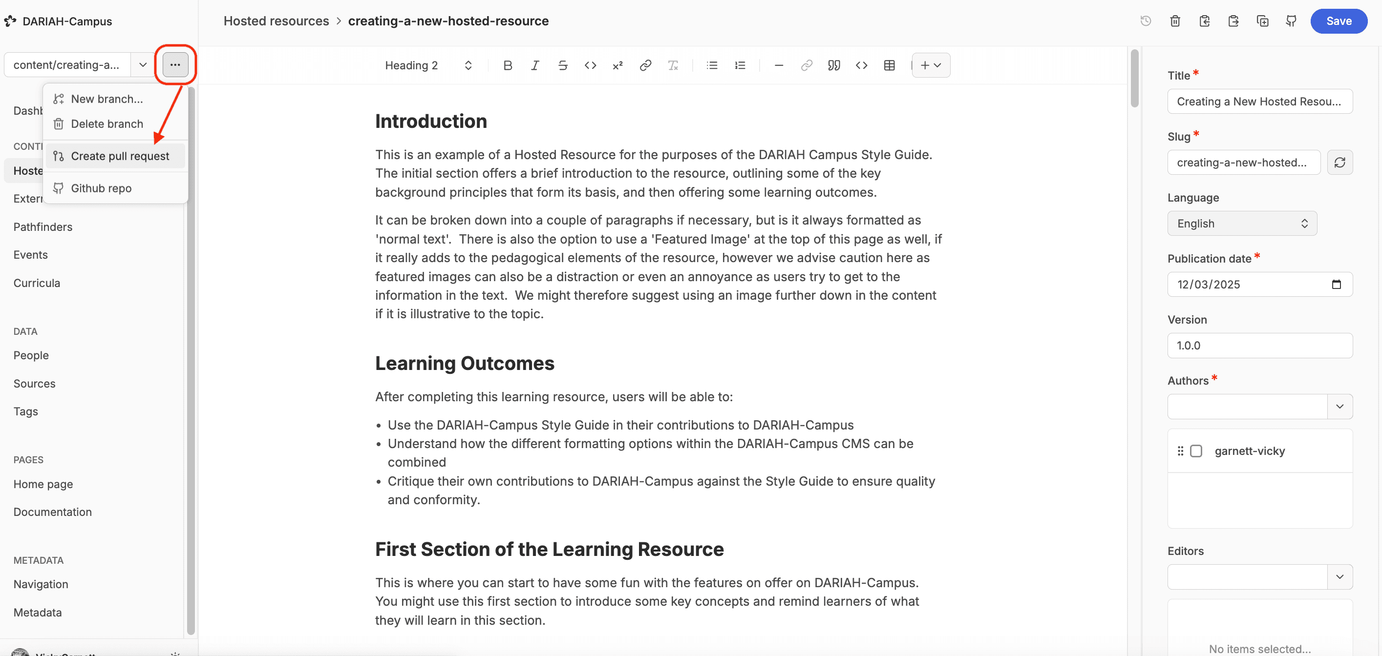
Now you have saved your resource, and are happy that it has all the information you want to include in there, you can save the resource again, and then move to create a pull request.
Click on the ‘Branch Options’ button (three horizontal dots, next to the Branch Dropdown menu), and select ‘Create Pull Request’.
This will bring you to the GitHub site, where you can create the Pull Request by clicking on the green button halfway down the page saying ‘Create Pull Request’ (depending on your screen size, you may have to scroll down to see this button).
The screen will now change to show you the actual pull request that your draft is filed in on GitHub. After a short while, a ‘Vercel bot’ will post an automatic message to the Pull Request which includes a table showing a summary of the latest updates. In this table you will see a link to ‘Visit Preview’. This link will always bring you to the latest successfully built preview of your resource. You can click on this to see how your resource looks on the DARIAH-Campus website. Do note, this is only a preview link, and should not be shared in any official capacity.
You can continue to edit your hosted resource in the CMS to refine it, or as required by the Editorial Team. Once everyone is happy, the Editorial Team will publish this to DARIAH-Campus for you.